| Image |
Comment |
| 01/30/2010 02:26:02 PM |
|
 Photographer found comment helpful. Photographer found comment helpful. |
| 10/21/2009 01:14:54 PM |
cure-dents extrêmeby Ecce_SignumComment: Originally posted by JEFFJSB:
not moving on it's own |
Am sure your not the only person that felt like this. Maybe if you thought (like me) that my arm is the subject moving into or out of the frame you'd have felt differently? then just marked it down for the content?
The last time I risk life and limb for an image I think ;) |
| 10/07/2009 04:53:23 PM |
|
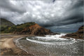
| 09/23/2009 02:36:59 AM |
High Tide by taljComment: WOOT and a big congrats T! Now, I promise I wasn't the 2 vote ;)
|
| Photographer found comment helpful. |
| 09/08/2009 08:38:29 PM |
Melanie by MAKComment: Butter wouldn't melt until I read your comments lol. A great capture proving that blowing out areas of an image can enhance the overall feel of it. So close to a ribbon and wonder if she were a little less cental or had a tear this would have ribboned Marac (am not suggesting you smack children btw). |
| Photographer found comment helpful. |
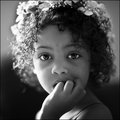
| 09/08/2009 08:28:56 PM |
Claraby NikonJebComment: Well, fwiw I think it met the challenge well and is a great study of a teenager with attitude! I love the colours and noise, sometimes the voters leave me cold, this is a cool portrait. |
| Photographer found comment helpful. |
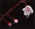
| 08/30/2009 09:12:41 PM |
"Weeping" Cherry Blossomby bcenuComment: Greetings from Andi via the Critique Club
First Impression: A good shot but don't like the border and would have prefered more negative space, on my monitor whilst there is plenty of pink the reds seem to be dominant.
Composition: I think this type of shot would be better received following the rule of thirds and would need more negative space around the subject.
Subject:The 3 stages of the Cherry Blossom work well and nice and pink but the overall feeling is of red. If the main blossom was larger in the image with more space to the right (without the border) this would have worked better for the challenge I tink.
Technical: Am confused by your choice of settings, F/13 and a 15 second exposure? not sure what lighting you had but at F/13 the entire image should have been in sharp focus and most of it is quite soft on my monitor.
Final thoughts:A good shot and whilst I like the subject and drops I think it would be better if it was sharper with more negative space around the main subjects. |
| Photographer found comment helpful. |
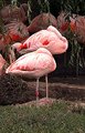
| 08/28/2009 06:54:11 PM |
Nap Timeby danculwellComment: Greetings from Andi via the Critique Club
First Impression: Rather than being drawn to the Flamingoes my eyes keep settling on the grass and its quite distracting for me.
Composition: I think the almost central subjects work well here with just the right amount of foreground and an interesting background, maybe a slightly lower perspective would have helped remove some of the boring middle ground.
Subject: Yup, Flamingoes are pink, a good/obvious choice for the challenge and meets it well. Yes, there were a few in the challenge but you didn't need to get 'that' comment (they left similar on several shots and should be ignored imho).
Technical: I think the technicals are what hurt your score, too much of the main subjects are blown and not very sharp. Not sure of your post processing but what looks like too much shadow/highlight has been applied resulting in odd colours in the bg birds and the great looking branches hanging down. The foreground grass is an odd colour and looks over sharpened.
Final thoughts: With some better editing this image could/should have scored higher than a 5. |
| Photographer found comment helpful. |
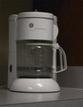
| 08/28/2009 04:14:34 PM |
12-Cup Coffee Makerby 777STANComment: Greetings from Andi via the Critique Club
First Impression: A little plain and flat for me, maybe if there was some coffee boiling away it would add a little interest to the shot?
Composition: I quite like the strong lines you have in the shot but would like to see the left of the coffee maker dead straight with the edge of the frame. A couple of commenters mentioned a lower angle but you'd lose those nice lines - maybe more from above would be better?
Subject: There were some very creative shots with ordinarily boring images in the challenge but sadly you didn't get this image to 'pop' or show any real creativity.
Technical: This worries me a bit as if that long list of editing steps was for this image I think you might be in for a call from Site Council and, imho you didn't need most of the tools to produce this image as its still quite flat and lacking in any contrast on my monitor.
Final thoughts: I do think it probably ended up with the score it deserved. Yes, its a shot of a 12 cup coffee maker but I (like most viewers) would be looking for something a little more interesting. |
| Photographer found comment helpful. |
| 08/27/2009 06:49:37 PM |
Blironingby TimosabyComment: Greetings from Andi via the Critique Club
First Impression: Certainly grabs my attention, I'm a big fan of negative space even with the small dpc images. Crisp, light, bright and humorous, I like it!
Composition: I do like the dynamics of your composition and did I mention I love the negative space? Maybe if you had cropped out the bottom of the Blironing board it would have been more pleasing and removed most of the blue bottom left. I'm a fan of odd angles as well, it works well for me here.
Subject: Nice idea to juxtapose the 2 main subjects however an ironing board doesn't shout appliance to me. Plenty of humour here, did you think of getting somebody to flick the switch on the wall for your final shot and blend the fruit?
Technical: A couple of minor niggles, the blue remnants of your post processing to get the bg bright and white background bottom left might have stopped this scoring the 6+ it deserved and the focus/colour on the arms is a little off for my liking.
Final thoughts:Love the idea and the shot you submitted, imho it was a couple of minor issues away from a ribbon so well done! |
| Photographer found comment helpful. |
Home -
Challenges -
Community -
League -
Photos -
Cameras -
Lenses -
Learn -
Help -
Terms of Use -
Privacy -
Top ^
DPChallenge, and website content and design, Copyright © 2001-2025 Challenging Technologies, LLC.
All digital photo copyrights belong to the photographers and may not be used without permission.
Current Server Time: 08/08/2025 03:48:13 PM EDT.