| Image |
Comment |
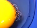
| 03/07/2003 01:15:54 PM |
Egg Yoke by JMSComment: Great idea. Great color. I would really have to "nit-pik" to point out that the reflections from the light sources are a little too sharp and revealing. Probably should have been diffused. |
 Photographer found comment helpful. Photographer found comment helpful. |
| 03/07/2003 01:13:14 PM |
Eggquisiteby JeanComment: I really liked this image. Good use of color. I wish top left side of the second egg was a little more focused. |
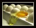
| 03/07/2003 01:10:02 PM |
Crackedby robbiehComment: I think I would have rated this higher if the color balance was whiter (looks like it was shot under flourescent lighting. Focus should have been just a little more forward in the shot (front edge of broken egg is not focused, but egg behind broken one is). Still a great idea and shot. |
| Photographer found comment helpful. |
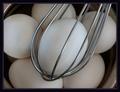
| 03/07/2003 01:06:48 PM |
Not Whipped Yetby jaygComment: Nice shot. The discoloration on the lower left side of the main egg draws my attention and think it would be better with a smoother, more evenly colored egg. Image overall seems to lack some punch (maybe slightly underexposed?). I do like the concept, composition, and dof. |
| Photographer found comment helpful. |
| 03/07/2003 01:02:51 PM |
U n t i t l e d #12by lumbardhComment: Like the high key style. This one is maybe just a little too high key for my taste. I think I would like to see (barely) the right edge of the egg or at least until it was out of frame. |
| Photographer found comment helpful. |
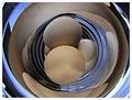
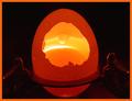
| 03/07/2003 12:59:45 PM |
Sunrise in the Cosmic Egg by BitzComment: Like the concept! Great lighting and color. Would have liked to see either more or less of the object that is holding the egg. |
| Photographer found comment helpful. |
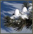
| 03/07/2003 12:58:05 PM |
How eggs are grownby Dim7Comment: Very good. I would have liked the needles to be greener (seem de-saturated). I probably would have used three eggs for a slightly better composition. |
| 03/07/2003 12:56:11 PM |
|
| Photographer found comment helpful. |
| 03/01/2003 02:57:23 PM |
|
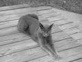
| 06/09/2002 09:40:00 PM |
The Grey Catby Pete02tComment: A good b&w usually needs some BLACKS and some WHITES. Not enough contrast or range to interest me. I do like the composition and the position of the cat. I may have moved her(him?) a little to the left to enhance the composition a little. |
Home -
Challenges -
Community -
League -
Photos -
Cameras -
Lenses -
Learn -
Help -
Terms of Use -
Privacy -
Top ^
DPChallenge, and website content and design, Copyright © 2001-2025 Challenging Technologies, LLC.
All digital photo copyrights belong to the photographers and may not be used without permission.
Current Server Time: 07/28/2025 09:09:23 AM EDT.