| Image |
Comment |
| 09/07/2004 10:40:11 PM |
Beggerby hcuevaComment: Little soapy... B/W would do better justice to the scene, although colors are good by themselves. They give illusion of hope which I see none in the circumstances. Message edited by HBunch - Critique Club status removed. |
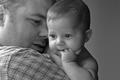
| 09/07/2004 10:37:05 PM |
... for my sonby debitiptonComment: Nothing to critique. Professional work, score is 10 out of 10. Message edited by HBunch - Critique Club status removed. |
 Photographer found comment helpful. Photographer found comment helpful. |
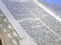
| 09/07/2004 10:35:34 PM |
FAITHby SDWComment: Not bad for a beaten up setup. The edge of the Book could be better set in focus. Light is good, the background is fair. Message edited by HBunch - Critique Club status removed. |
| Photographer found comment helpful. |
| 09/07/2004 10:33:14 PM |
Hope is in the Churchby skiefComment: Technically - no concerns. The dome texture could be sharper but I guess this camera did the best it could here. Annouing is the loudspeaker and the name of composition is doubtful for me. Message edited by HBunch - Critique Club status removed. |
| Photographer found comment helpful. |
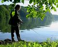
| 09/07/2004 10:28:31 PM |
Fish on the menuby RUEDISCHMUTZComment: From the critique club...
A polarizer is a must for such kind of scenes... Leafs on top are in "nowhere" zone. Either candid camera with lots on top or just a hint to frame the scene. Foggy prospective is really good. |
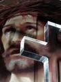
| 09/07/2004 10:24:21 PM |
Without His love we would have no hope.by curt57Comment: From the critique club...
No discussion on the subject, not "my" theme.
The only technical concern is visible arifacts of journal print. I would prefer softer look of the background retaining sharpness on the cross, |
| 09/07/2004 10:21:01 PM |
Please Mum ...by ScantyNebulaComment: From the critique club...
Overall - not bad at all. I like the high key, lighting and colors. The only concern is tight and inconsistent cropping. The boder touches the cup? cuts the paw and reaches the ear. I would cut 1/3 of the cup but leave space on top and bottom. |
| Photographer found comment helpful. |
| 09/07/2004 10:12:36 PM |
DNA: Hope for a brighter future?by CamazineComment: Putting aside the subject, the shadows are too harsh relative to the overall softness. Skin tone seems to have some casting that does not correlate with the scene and color pallette of the speckles. Also the projected slide could have better match with the body shape. |
| Photographer found comment helpful. |
| 09/07/2004 10:08:02 PM |
I "Hope"by rogerspaulComment: Funny but too abstract. I would prefer the frame moved left a bit: too much space on the right - no dynamism. Message edited by HBunch - Critique Club status removed. |
| 04/28/2004 06:01:00 PM |
|
| Photographer found comment helpful. |
Home -
Challenges -
Community -
League -
Photos -
Cameras -
Lenses -
Learn -
Help -
Terms of Use -
Privacy -
Top ^
DPChallenge, and website content and design, Copyright © 2001-2025 Challenging Technologies, LLC.
All digital photo copyrights belong to the photographers and may not be used without permission.
Current Server Time: 08/03/2025 11:21:20 PM EDT.