| Image |
Comment |
| 02/11/2004 12:22:32 AM |
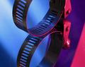
Clampby JC_HomolaComment: From critique club.
I agree with the resto of the commenters - the color composition that can not go wrong and fine composition. The reflection which is as perfect as image represents the title in full. I rated it among the best images for this challenge.
What annoys me a bit is some perspective distorsion at the top-left and the DOF which covers only 1/3 of the image in the middle. I'd love the top and bottom sharper.
There is another though regarding color. The whole image consists of two tones, yet at the bottom-right we see a bright hilite. It would be aceptable if the image revealed some of the stainless steel gray - may be a little of the white light from the left... Or, otherwise - the hilite was dimmed a bit. |
 Photographer found comment helpful. Photographer found comment helpful. |
| 02/11/2004 12:06:10 AM |
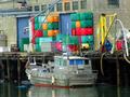
ships and cratesby unknowndeathComment: From critique club.
The challenge conditions stated "...Using the kind of things you'd typically find in a garage..." where "a garage" would mean any kind of garage.
I gave this image +7 for the colorful garage art - nice shot and a great eye!
The discount was made for the lack of sharpness and non-leveled scene. |
| 02/09/2004 06:33:50 PM |
Aquarius - the water carrierby johnmComment: From critique club.
John, actually, I was not lazy to check out your other works and can see some amazing stuff among them!
Everything is good about this image: quality, color, angle and content...
However, I did not rate this one high (+5) because it does not create any nice mood... like some lame postcards (no offence meant!). When something plane and dull is suddenly associated with high ideas and does not make fun of it really but instead makes them look plane and dull. Sorry... |
| Photographer found comment helpful. |
| 02/09/2004 06:24:36 PM |
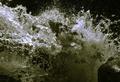
aquarius - threatening silence sudden out burst extreme temperby xburnerxComment: From critique club.
No... This is not an aquarius - I know a bunch of them! ;-))
Despite all said I dont' have any problem with the quality of the image - it's fair for me. I would recommend editing the title: use more dashes or commas or even split it into sentences. Otherwise I don't understand it :-( |
| 02/09/2004 06:19:12 PM |
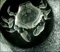
Cancer /Crabby trainComment: From critique club.
This image looked like a disappointment to me, I gave it just 3 :-(((
Having read the author's comment I realize that this shot is a technical curiosity rather than just a crab and would probably give it more credits after all. But still, I have a problem with the composition (why crab is cropped? I don't argue with the off-center displacement!) and the idea (what does this all mean?). Technically, I would experiment with some colored lighs and made more of the vase texture visible around. |
| 02/09/2004 06:09:05 PM |
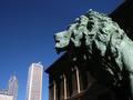
Leo: Most Dominantby relgraphicsComment: From critique club.
I gave this image high score for the interesting idea.
Qualitywise, I wonder why at f=8 the background is so sharp? Also the shadows on the lion are blending with the shadows of the building - this leads to missconception. And finally, I am not too confident in this bronze green - in reality it usually looks differently but I won't insist on that ;-) |
| Photographer found comment helpful. |
| 02/09/2004 06:01:50 PM |
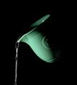
The Water Pourerby ColeyComment: From Critique Club.
This is a very good shot with perfect composition, great intriguing light distribution and color range. 'The Water Pourer' is the exact translation of Aquarius zodiac from my native language and I am not sure if 'Water Bearer' really suits the Aquarius. This sign is misterious and sometimes indeciseive which might mean that Aquarius holds the water and promices to spill it, yet never does :o)
I did not rate the image very high just because I prefer more symbolism and abstraction, especially when it comes to zodiacs. |
| Photographer found comment helpful. |
| 02/09/2004 05:52:10 PM |
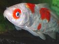
One Sad Fishby basia03Comment: From critique club.
The expression is really sad. The image is not defocused - it's just the fish moving (I think). Too bad that I did not see the author's comment at the voting time. If I knew the reason for 'sadness' I would gave this image higher score.
On the composition I would expect to see the fish eye in the middle of the frame and, probably, some side-lighting to get reflections from the scales, but that's difficult in the restaurant... |
| Photographer found comment helpful. |
| 02/09/2004 05:43:11 PM |
This week horoscope says "the moon is in libra"by alexvoloComment: From Critique Club.
I agve this image high score despite some earlier mentioned 'uncomfortness' to the eye. I value the idea a lot as well as the choice of the background which is clearly symbolizing the night and moon. The scales is an interesting object to watch and learn details. Definitely not a dull image! |
| 02/09/2004 05:37:04 PM |
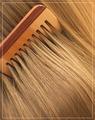
Comb & Hair by Harz_JoergComment: From critique club.
I gave this image one of the highest scores in the challenge and glad that it did well in the final. Warm, soft mahogany of the comb and live gold of the hair please the eye.
The frame creates the 'zoom' illusion which I think works great here - my compliments.
I was experimenting with my daughter's hair and wooden comb too, but did not get anything acceptable. The birch comb with it's sparkling texture and dark hair looked very cold even with colored lghting. And this rendition I like much more.
My only problem in the end is that hair and comb is too trait theme ;-) |
| Photographer found comment helpful. |
Home -
Challenges -
Community -
League -
Photos -
Cameras -
Lenses -
Learn -
Help -
Terms of Use -
Privacy -
Top ^
DPChallenge, and website content and design, Copyright © 2001-2025 Challenging Technologies, LLC.
All digital photo copyrights belong to the photographers and may not be used without permission.
Current Server Time: 08/04/2025 09:39:37 PM EDT.