|
|
|
Showing 311 - 320 of ~1697 |
| Image |
Comment |
| 05/14/2007 08:53:38 AM | I Am Not Going To Get Up Today, published 1987by Buckeye_FanComment: Greetings from the Critique Club!
A clear representation of the struggle between parent and teen to get the child out of bed in the morning! I'll bet you did have fun! The expression on the girl hints at it without telling too much that it was set up...which of course it had to be. The lighting is nice, it sets the "morning" mood fairly well and preserves detail across the exposure.
On the challenge side of things, does it scream "Seuss"? Certainly one of his titles. The bright colors in the blanket head in a Seussian direction. The rest of the colors don't really add as much to the theme. Playful yes, but it seems to lack a strong feeling of illustration, of blocks of color and drawn lines, that would help strengthen the connection to the challenge topic.
Overall, a fine image that stands on its own but sits on the edge of the challenge.
Keep having fun and shoot what you love! |  Photographer found comment helpful. Photographer found comment helpful. |
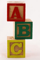
| 05/14/2007 08:42:12 AM | A B Cby izadoodleComment: Greetings from the Critique Club!
I like wood blocks and the way they can help me recall the other things of childhood. This image, however, does seem like a "product shot"...which is fine except in the context of the challenge. Yes, Dr. Seuss published an A, B, C's book...but so have many other children's authors... What makes this particulary Seuss-like?
The lighting renders the texture of the face of the blocks. The background neither adds nor detracts from their representation. The blocks are carefully arranged, neatly stacked...but not very reminiscent of the energy or mischeviousness of Seuss.
Overall, the shot is technically competent and offers a record of wood blocks.
Keep shooting and play whenever you can. |
| 05/13/2007 04:20:12 PM | My Piby heavyjComment: Greetings from the Critique Club!
I really like the pose! What a playful image! The glasses add to the concept of playful fun.
I think, however, that the representation of Pi would have more appeal if it had been painted on...it feels odd to me to see shadows cast on her torso from the cut-out. And it fits the challenge only by this addition. As one commentor pointed out, there are plenty of Pi curves on the female form...this is not really one of them.
The lighting is the largest liability in the image...too bright on the chest causing blown out highlights...too strong and uni-directional causing unflattering shadows to be cast on "Pi" the supposed subject of this image. Perhaps a little reflected fill light would have helped to even out the light and created better modeling of the subject. Also, without backlight her hair disappears into the void...a loss that takes away from her form and figure.
Overall, I think you've made a good beginning toward photographing the human figure but need to strengthen the connection with the challenge if high scores are your aim.
Hope you don't find my comments too harsh...PM me if you do. | | Photographer found comment helpful. |
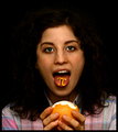
| 05/13/2007 03:49:45 PM | Orangeby DoubledizzleComment: Greetings from the Critique Club!
The first impression this image makes is one of sitting across a lunchroom table and having someone pull a practical joke...funny, in that way. Except there's no context for it and no real reason (beyond the challenge topic) for the image.
You already know that next time you'll light the background to separate the subject...and someone else has pointed out that the highlights on the orange membrane are blown...so what can I add? I agree with both points. Her face is evenly lit and the skin tones well-rendered. But the highlights in her eyes leave her expression lacking.
Overall, this is a fairly funny and competent image which, given more time, could have been better.
I hope you won't find my comments meaningless...but if you do, feel free to PM me. |
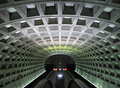
| 05/13/2007 02:58:02 PM | Right Down the Middleby levyj413Comment: Greetings from the Critique Club!
First, thank you for filling out the comments with something more than technical information! Second, although you broke 6 I hope you won't stop shooting these...I love the DC Metro--no place quite like it!
Clearly fitting for the challenge topic and rhythmic as well as symmetric. The repeating lines of the metro arches are just fun to look at. I think not everyone can easily interpret the location, however. Perhaps if there were trains speeding through on the rails it would help to define the space.
The colors of light that only become evident when placed on photographic medium are intriging...it's odd how much our minds compensate for the vagaries of our vision. I must, however, agree with one commentor that the white light dead center is a distraction...easily fixed in Advanced but must be lived with in Basic.
Overall, I believe you know what you're doing when you make an image. If I were to nudge you in any direction it would be toward finding the poetic expression that lies a little deeper in your soul. (But, hey, what do I know?)
Thanks for making this image and sharing it! | | Photographer found comment helpful. |
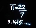
| 05/13/2007 02:43:37 PM | Pi equals...by sekarmalathyComment: Greetings from the Critique Club!
Welcome to DPChallenge and congratulations on making your first challenge entry. (The first one's always the hardest.)
On first view, this image strikes me as a graphical illustration more than a photograph. Yes, I know, that it was written with light...but perception is stronger than fact. The only thing that tips it toward the "fact" are the appealing star patterns on the points of light and the tops of the numbers 2 and 7. Beyond that there's not much that differentiates it from a drawing.
Clearly shooting for the challenge you've taken a literal (if numerically incorrect) approach. Voters do often hold the challenge topic in high regard, but not just the challenge topic....now you know. Perhaps applying this same technique to an interesting, meaningful and dimly lit background would have carried the idea a step farther?
I hope you will continue to work at the craft of photography and enter more challenges! DPC is a great place to play and learn!
Regards, Kadi | | Photographer found comment helpful. |
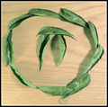
| 05/13/2007 02:30:18 PM | Ancient Mathby sudhiComment: Greetings from the Critique Club!
At first view, I only say a circle of leaves on a blank table...then I noticed the Pi configuration. Though the title helps point in the direction of your theme, it wasn't until I read eqsite's thoughtful comment that I finally "got it". I guess sometimes we all need a little help. :) Is it "uninspired" as one commetor wrote? No. Clearly not. But it is a straight on shot that does take a little work to get to the meaning.
On it's own, it feels like an unfinished idea. The lighting from the side helps to add texture to the leaves but overall it feels flat...mostly evenly lit with little for the eye to explore. To capture the idea of "ancient" perhaps an older looking background...or a purple cloth...would help? To convey the concept of laurel wreath clearly, more leaves closely knit together?
Overall it answers the challenge but, for me, it does little more.
Hope you don't find my comments too harsh...feel free to PM me and let me know if you do. |
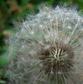
| 05/13/2007 01:58:39 PM | Dandelion Clockby iamthirdComment: Greetings from the Critique Club!
The first thing that strikes me about this image is the fine detail on the seeds. It's a slightly different take on the much-done subject of dandelions. This choice of depth of field clearly moves the emphasis to the inside of the seed head...but I'm not sure it "works" well. For my tastes, I'd like to see both the seed heads and their parchutes rather than looking through the blur of fluff. The background is natural and nicely out of focus but the pattern of green and brown is still quite strong and so makes a distraction that pulls the eye away from your subject.
For the purposes of the challenge it appears the voters didn't find a very strong fit with the topic of symmetry. By looking at the other entries in the challenge it seems that well-divided, centered topics worked best. I like the placement of the dandelion in this image and the choice of square crop...just not effective for the challenge.
Keep experimenting and always shoot what you love! | | Photographer found comment helpful. |
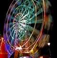
| 05/13/2007 01:08:06 PM | Big Wheel Acceleration = ( 4 x Pi Squared x R ) / ( Time Squared )by JonathanJComment: Greetings from the Critique Club!
What a lovely sense of color and motion! The geometry of shapes in this image really pulls me in! However, I have to agree with some of your commentors that the relationship to the challenge is somewhat weak and mostly argued in the title.
The image itself is exciting to look at...all the way to the little stars made by the lights. I feel the composition could be strengthed by a different point of view. The cropping of the top of the wheel is fine but I'd like to be viewing this from about 15 degrees to the left so the wheel would appear more round. The lamp in the lower right hand corner is also a liability, in my view. It demands attention because it is so well defined against the black space.
Overall, a great subject and a wonderful approach to it!
Keep shooting! | | Photographer found comment helpful. |
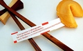
| 05/13/2007 11:57:16 AM | An Irrational Fortuneby m_sarzynskiComment: Greetings from the Critique Club!
What a clever answer to the challenge topic! Pi is represented in so many ways in this image that not only does it meet the challenge but one could guess the challenge topic without knowing it. Love the title, too!
What strikes me most about this image is the puzzle it poses. I like the ideas in the image more than the image itself. The composition holds all the elements but I'm not fond of the mergers with the frame in the upper left and right corners--one maybe, but not both. I guess I'd choose to bring the cookie into the picture entirely to help preserve the concept of circle it conveys.
The lighting feels odd to me, as well, on two points. The color balance feels off...somehow too blue in parts and yet there appears to be a yellow light source too. Secondly the shadows...or near lack of them. The lighting provides some definition of shape on the cookie...but that is lost on the chopsticks especially where they meet near the block. I think lighting may be the one most important element holding this image back.
Overall, a clever concept competently executed. Keep shooting and entering! | | Photographer found comment helpful. |
|
Showing 311 - 320 of ~1697 |
Home -
Challenges -
Community -
League -
Photos -
Cameras -
Lenses -
Learn -
Help -
Terms of Use -
Privacy -
Top ^
DPChallenge, and website content and design, Copyright © 2001-2025 Challenging Technologies, LLC.
All digital photo copyrights belong to the photographers and may not be used without permission.
Current Server Time: 08/25/2025 01:38:18 PM EDT.
|