| Image |
Comment |
| 05/18/2007 05:29:33 PM |
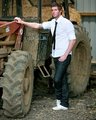
Farm-5.jpgby judojoeComment: Like the city boy in the country idea of this! Really says "weekend" and grandpop's! |
 Photographer found comment helpful. Photographer found comment helpful. |
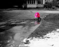
| 05/18/2007 05:12:33 PM |
bright spot on a rainy day.jpgby abduckComment: I like the composition and the idea expressed!
I think the girl is a little unsharp...a bit more contrast there would help, in my opinion. Maybe up the reds on the coat to help separate the girl from the umbrella a bit as well? I agree that the reflection helps make the pic and adds that little bit of surprise. |
| 05/16/2007 03:56:09 PM |
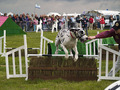
The Doggie Derbyby RalphcoComment: Greetings from the Critique Club!
I like the stop action on this sports shot. The image has a photojournalistic feel to it and would make an nice contribution to the local paper. I do agree with those commentors who said they'd like to see more of the handler in the image. It appears that you were shooting under crowded conditions and may have had little room to move one way or the other. I'm guessing that the minor distraction in the lower right corner belongs to something (or someone) that may have gotten in your way. Still, it's important, I think to avoid cutting people in half...and especially here where the main subject is interacting with her.
The setting is clear. The activity needs no further explanation than the photo provides. I like the blurry crowd of on-lookers. I especially like the cut out dogs in the background which echo the subject of the image.
Technically the shot is very well done. I think the color is a tad off...I took it into PhotoShop to check and found the whites could be a little brighter and the colorcast (a faint pink) lifted. It just adds that extra bit of pop to the image.
The dog itself might have had a better moment a fraction of a second later. With the attention of the dog on the trainer his gaze leeads us away from the feat. In a moment he would reach closer to the ground before landing, his tail might have raised a bit and his head turned in the direction of the camera. I know I'm being picky...but this type of situation is where I employ burst-mode to try and get the "decisive moment."
It appears to have been a difficult subject to shoot and I think you did a very good job of it. Fighting wind, clouds, and crowds while trying to capture a fast moving subject can't be a cake walk!
Nicely done! |
| 05/16/2007 11:34:26 AM |
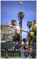
Are you ready for this?by xtianComment: Greetings from the Critique Club!
What a nice moment! Stopped action, great expression on the player....and look at those muscles! The sand adds a nice touch.
The background is this image's biggest liability...you know that and so did your commentors. I think opening up the lens to its widest f/4.0 would help...and in these bright conditions that could easily be done by bringing the ISO down to 100.
I like the inclusion of the referee with the whistle in his mouth. It puts the game in context. I also like the palms and condos in the background which add to the setting. I agree with one commentor that the advertisements are a distraction. Any time there's text in an image it begs to be read. But the most bothersome of the background elements to me is the woman in blue framed between the player's legs. So, other than changing your camera settings, hunting around for a good background and waiting for the action to happen in front of it can also be a good strategy.
I also like the angle of view that puts the viewer slightly below the plane of the leaping player. I'd prefer to see more sand and less sky. I'd like to see more indication of the net, too, since I thinkk it would add to the story of the sport being played.
Your risk-taking payed off and the voters rewarded you...but I think it's worth going back and perfecting this type of shot. Nicely done. |
| Photographer found comment helpful. |
| 05/16/2007 09:35:08 AM |
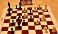
Two Knights Defense (56) -White to Moveby whiterookComment: Greetings from the Critique Club!
Interesting looking game set up. I can understand the idea of chess as a sport...but the other part of the challenge was to show the action. I think including some human interaction with the pieces would help immensely in that regard. Perhaps showing a hand poised over one of the white pieces as if deciding to make the move?
The lighting is very yellow and unflattering in this image. I think using the camera's white balance compensation or fixing it in post-processing would help. The direction of the lighting (coming from almost directly over head) shortens the shadows and makes it hard to see the detail in the black pieces...the two bishops, for example, almost look like one object. At the same time the tops of the white pieces are too light...for example, compare the tops of the two nearest white pawns with the pawns guarding the king.
Subject is just one element of a photograph but lighting is everything!
Keep shooting what you love.
Regards, Kadi |
| Photographer found comment helpful. |
| 05/14/2007 10:46:52 AM |
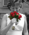
IMG_4430 copy_filtered small size.jpgby AdrienneGCComment: Lovely expression! I can practically smell the roses myself!
Desaturation is skillfully done. Lighting is pleasing.
Only quibble, the background is unflattering to the subject.
edit: yup. there are some minor spills on the desaturation...fixable, of course. Message edited by author 2007-05-14 10:48:35. |
| Photographer found comment helpful. |
| 05/14/2007 09:38:52 AM |
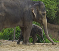
Horton's Early Yearsby MarkComment: Greetings from the Critique Club!
I laughed when I read the title! As shoe-ins for challenges go this one is forgivable. :)
I really like the way the posture of the baby and the mother echo each other! The baby is nicely framed by the area between the adult's trunk and forelegs. It looks like it was taken on an overcast day which helps to keep extreme shadows from interfering with the detail on these dark subjects.
I would like to see the background be a little less intrusive to help isolate the subject from the zoo environment...blurring, for example, could help. But since you opened your lens quite wide you must have been rather close to the subject and not able to limit the DOF as much as you might have liked. Under this editing rule-set you could have blurred in post process.
I also find the post in the background bothersome. Because it's similar in color to the elephants it looks like an extra leg holding up the adult. If I were cropping this image I'd start just to the right of that post...really nothing to its left is necessary for the composition. This crop would change the orientation of the image...but I think it would further isolate the subject and focus attention more strongly on the lines and shapes repeated between adult and infant.
Overall, a nice animal portrait! |
| Photographer found comment helpful. |
| 05/14/2007 09:25:51 AM |
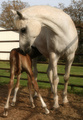
H h H....Hungry horseby sfmorrisComment: Greetings from the Critique Club!
What a nice capture of a tender moment between a mare and her nursing filly! I like the light and the way it presents the shapes of the two horses. The quadropod stance of the filly is classic! What a beautiful line the curved neck of the mother makes!
The setting is traditional farm. The inclusion of the fence and barn in the background clearly convey that. Though I do tend to agree that the brightness of the white building pulls attention way from main subject. I keep looking at this wondering how it could be even more intimate for the viewer...somehow a different angle of view to eliminate more of the trees...or a wider aperature to blur the setting a bit more?
As far as the challenge goes, I don't know what's on page Hh of the Seuss A,B,C book...probably a horse. But it was the voters who needed convincing, not me.
Overall, it's a lovely portrayal of a horsey moment.
Keep shooting what you love! |
| Photographer found comment helpful. |
| 05/14/2007 09:15:25 AM |
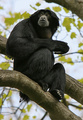
I Just Heard Horton's Who!by madcrabberComment: Greetings from the Critique Club!
Nice portrait of a primate! I like the detail in the fur and the light in the eyes. The expression on its face conveys the concept of something just heard. The background adds context without being distracting. Under this editing rule-set it would have been possible to "clean up" the dirt hanging from the Siamang's bottom...I understand that's how it was but I think one can break away from photojournalism from time to time.
The largest factor in the score must be the tenuous connection to the challenge. Other than the title there's nothing, in my opinion, that connects this to Dr. Seuss. Horton is an elephant, the Who are little balls of fluff...that another animal in the jungle would hear the Who, too? Well, maybe.
Overall, a fine image that squeezed its way into a challenge. :)
Keep shooting what you love! |
| Photographer found comment helpful. |
| 05/14/2007 09:05:05 AM |
Green eggs and hamby Rino63Comment: Greetings from the Critique Club!
A cute studio set-up. The lighting is fine, the composition compact and unified. It hints at playfulness. However it's connection with Seuss is not as strong as it could be. I can see that the red background and the cartoonish stuffed animal work in the direction of the Seuss theme. But the choice of plate (square and patterened) work against it. More familiarity with the book would have helped you here...both the eggs and the ham should be green and the eggs should be fried. The stuffed toy isn't close enough to either character from the book...and so moves the Seuss fan away from being convinced. In the book, the plate is round and large, more like a platter and held like one on fingertips by the character who offers the green eggs and ham throughout the story. A fork sticking up from the food is also characteristic.
Overall, technically fine but lacking when it comes to the challenge. Bravely done! |
| Photographer found comment helpful. |
Home -
Challenges -
Community -
League -
Photos -
Cameras -
Lenses -
Learn -
Help -
Terms of Use -
Privacy -
Top ^
DPChallenge, and website content and design, Copyright © 2001-2025 Challenging Technologies, LLC.
All digital photo copyrights belong to the photographers and may not be used without permission.
Current Server Time: 08/25/2025 01:12:54 PM EDT.