| Image |
Comment |
| 04/14/2004 01:01:42 PM |
Propeller Powerby cbellerComment: Technically well donw. I think it lacks movement to convey the power aspect. |
 Photographer found comment helpful. Photographer found comment helpful. |
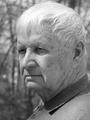
| 04/14/2004 01:00:35 PM |
Dadby basia03Comment: Nice portrait. Might benefit from some fill lighting to lessen the shadow across the lips. |
| Photographer found comment helpful. |
| 04/14/2004 12:57:57 PM |
|
| Photographer found comment helpful. |
| 04/14/2004 12:53:57 PM |
Strength is in the Cardsby rudacbComment: Nice take on the subject. Like the tonal range and choice of lighting. Unfortunate reflection in the glass of room and photographer is distracting to me. |
| Photographer found comment helpful. |
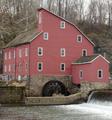
| 04/10/2004 12:05:00 PM |
Water Wheel (Old Red Mill)by laserComment: You picked a tough one given how well known this subject is. I feel the color is flat rather than soft, but I'm afraid (other than waiting for a less overcast day) I don't know how it could be improved from a technical standpoint. Composition is o.k. though the horizontal seems off. Wheel lacks emphasis due to lighting and lack of sharpness. (Just my opinions, throw me a raspberry if you don't agree.) |
| Photographer found comment helpful. |
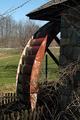
| 04/10/2004 11:57:05 AM |
Retired Water Wheelby DrakeComment: Just my few thoughts: Less depth of field would make this pop a bit more. The angle makes this look a bit like a waterfall--cool. A different time of day might have pulled up the detail in the shadow. |
| Photographer found comment helpful. |
| 04/10/2004 11:52:40 AM |
Moving Onby summer_romanceComment: Yes, it's too small, but the contrast helps make up for it. Nice point of view, and choice of lens angle. |
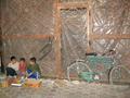
| 04/10/2004 11:50:00 AM |
I have no idea....by GOLNAZZZComment: I like the photo-journalistic quality of this. The detachment of the boys from the bike seems to say a lot about their every day world. More contrast and sharper focus would make this a bit better. |
| Photographer found comment helpful. |
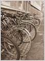
| 04/10/2004 11:47:52 AM |
University Wheelsby nordicComment: Nice. Stands on its own. Sepia and graininess feel right. No real dark darks or bright brights--think a greater tonal range could improve this. |
| Photographer found comment helpful. |
| 04/10/2004 11:45:36 AM |
Move! Fast!by karmatComment: Cool idea! There isn't enough of the tread showing to really intimidate me--takes awhile to understand what this is and by then I'm not scared, the impact is lost. I wonder if a similar composition on the vertical would work better? |
Home -
Challenges -
Community -
League -
Photos -
Cameras -
Lenses -
Learn -
Help -
Terms of Use -
Privacy -
Top ^
DPChallenge, and website content and design, Copyright © 2001-2025 Challenging Technologies, LLC.
All digital photo copyrights belong to the photographers and may not be used without permission.
Current Server Time: 08/24/2025 06:40:41 AM EDT.