| Image |
Comment |
| 04/01/2005 08:52:23 PM |
|
 Photographer found comment helpful. Photographer found comment helpful. |
| 03/29/2005 08:34:27 PM |
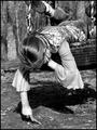
Dirt Doodling by glad2badadComment: Emotive! Lovely B&W! Great detail!
Can only suggest that it would be desirable to see the tips of the sneakers--I think they would help convey more attitude.
bumping. |
| Photographer found comment helpful. |
| 03/29/2005 08:32:28 PM |
A Moderate Majestic Malaiseby BlinksComment: This has the makings...almost.
Your selective de-sat is right on.
The extra saturation on the yellow, unfortunately, shows up badly on her feet.
A little more room to the left. A more level horizon. Just a bit more (or less) of the plant at the top....
So darn close! |
| Photographer found comment helpful. |
| 03/29/2005 08:30:12 PM |
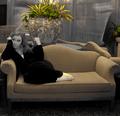
Burning the Midnight Oilby cheekymunkyComment: Ho, hum, just another...
NOT!
Love the cat! (A little disturbed that it appears someone dressed the cat, but...one would have to be entirely bored to do so.) Subtle, but effective. I'll bet this works well as a larger piece. |
| Photographer found comment helpful. |
| 03/29/2005 08:27:57 PM |
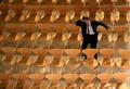
Tediousby H R VerryComment: Pattern in repetition--with the man as exclamation point!
If you could have found the angle to straighten out the top row with the top of the frame--or managed to crop it so, it would be all the more perfect. But, as is, a fine piece of work. Bumping 2 points. |
| Photographer found comment helpful. |
| 03/29/2005 08:25:38 PM |
under carpetby jamiaca07Comment: What a hopeful cat! Your picture reminds me of my all-time favorite pet "Max" -- ah such a time as waiting for us to appreciate their wonderful sense of humor, love and play. (Bumping a point just for the fond memory you have evoked.) |
| 03/29/2005 01:18:47 PM |
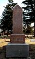
Bored Stiffby drake217Comment: Humorous! I think this could be improved, however. A more limited depth of field would have put the focus on your subject. Waiting for the light to strike the face of the monument would have emphasized the letters and, perhaps, made the etching at the top of the monument more evident. It also feels distorted, out of verticle--postprocessing with a perspective correction, or getting farther back with a longer focal length could change that. |
| Photographer found comment helpful. |
| 03/29/2005 06:44:11 AM |
|
| Photographer found comment helpful. |
| 03/26/2005 03:18:42 PM |
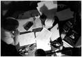
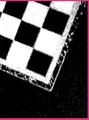
wmjby DingleBerryComment: Very cryptic! I'm afraid I don't understand your title. This appears to be a board, but I'm not sure how we get to "bored" from here. What happened to your border? It has only 3 sides! If it's me, I apologize for being so dense. If it's you, I hope you achieved what you were trying to. |
| Photographer found comment helpful. |
| 03/26/2005 03:15:34 PM |
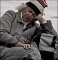
they are boredby annedalimataComment: They do seem bored.
Some things that might have improved this:
--lower angle to feature your subjects
--adjust levels to avoid the washed out effect
--different cropping so that, at least, the girl's arm wasn't cut off
--a more modest border--with such a broad black border you emphasize the lack of contrast in the image |
Home -
Challenges -
Community -
League -
Photos -
Cameras -
Lenses -
Learn -
Help -
Terms of Use -
Privacy -
Top ^
DPChallenge, and website content and design, Copyright © 2001-2025 Challenging Technologies, LLC.
All digital photo copyrights belong to the photographers and may not be used without permission.
Current Server Time: 08/27/2025 04:32:38 AM EDT.