| Image |
Comment |
| 01/21/2003 11:53:14 PM |
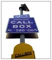
Freeway Call Boxby TarbiniComment: Effectively removing the background really brings attention to the sign. To me it feels that cropping part of the callbox was a bad move - could you perhaps have taken the photo from lower down to include all of it? Other than that the focus is pretty good. The border is also nice and simple. |
 Photographer found comment helpful. Photographer found comment helpful. |
| 01/21/2003 11:51:00 PM |
Last Stop in Lifeby GordonComment: Nice work - you have created the effect well. Your title is also very witty. One of very few "artistic" signs in this challenge. Well done. |
| 01/21/2003 11:47:53 PM |
Red Rock, Red Stopby YomiComment: Wow - that's certainly an interesting place to find a STOP sign. Your colouring and focus is brilliant - so much detail. The sign is also "crispy clear". My only (possibly) negative comment would be the alignment of the left edge of the rock and stop sign - perhaps more or less overlap between the two would be better? |
| Photographer found comment helpful. |
| 01/21/2003 11:45:46 PM |
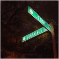
Gonsalves and Jerry Placeby daysezComment: The lighting on the tree is interesting. Did you use a flashlight perhaps to light the sign? Great clarity on the sign. I'm not sure from your title whether "Jerry and Gonsalves" is something I should recognise, or just a corner you chose randomly (perhaps where you live). |
| Photographer found comment helpful. |
| 01/21/2003 11:43:51 PM |
|
| Photographer found comment helpful. |
| 01/21/2003 11:42:04 PM |
lonely roadby imagesloyolaComment: It's a lovely b&w, with lots of atmosphere, but the road really steals attention from the sign. Framing is interesting - lot's of sky, but it helps create the mood for the photo. I just wish the sign played a more significant role in this photo. |
| 01/21/2003 11:38:37 PM |
Village Next Leftby kevinswopeComment: Ok, I'm probably not the first but there is no sign to be seen. Although your title does make a good substitute road sign. Composition of your photo is good and the shadows in foreground and distance help bring the tents into attention. Unfortunately it struggles to meet the challenge. |
| Photographer found comment helpful. |
| 01/21/2003 11:31:16 PM |
DUH!by MustbelostComment: Nice framing (both road and sign) and nice focus and exposure. Your title is also funny. |
| Photographer found comment helpful. |
| 01/21/2003 07:53:37 PM |
|
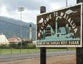
| 01/21/2003 07:50:52 PM |
Sweet Inspirationby CubComment: Unfortunately the title contradicts the factory and powerlines in the background, which doesn't look "sweet" at all. It's a shame you couldn't get a better background for this sign (obviously sugar cane would be great). Your focus and exposure on the sign is quite good. |
| Photographer found comment helpful. |
Home -
Challenges -
Community -
League -
Photos -
Cameras -
Lenses -
Learn -
Help -
Terms of Use -
Privacy -
Top ^
DPChallenge, and website content and design, Copyright © 2001-2025 Challenging Technologies, LLC.
All digital photo copyrights belong to the photographers and may not be used without permission.
Current Server Time: 08/14/2025 08:58:43 AM EDT.