| Image |
Comment |
| 01/23/2003 12:13:11 AM |
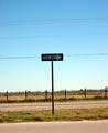
One way or the highwayby billypComment: A simple photo - which works well, I really like the concept. The sign looks just a little bit blury unfortunately (but perhaps it's just my eyes when I look closer). The power lines are a little distracting - especially the one passing through the sign. |
| 01/23/2003 12:09:45 AM |
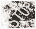
Plowed Overby connieComment: Very crisp and vivid - the snow has so much texture in it. Focus and composition are lovely - the only thing I would have done differently would be a little less snow around the top of the S (currently it blends a little too well). The border is very appropriate for the image. One of the better photo's this week. |
| 01/23/2003 12:06:17 AM |
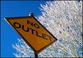
"Snow" Outletby DougPazComment: I love the detail in the tree it looks stunning - I hope you took a photo of it on it's own as well. Composition of the sign and tree is quite good. My only negative is that the lighting of the sign could have been slightly better - although I admit that people might think you strange lighting a street sign to remove darkness and reflections. Good work. |
 Photographer found comment helpful. Photographer found comment helpful. |
| 01/23/2003 12:04:02 AM |
Noisy Passengersby Geo_GriffinComment: Another humous title - well done, the photo is quite boring on it's own but the title rescues it somewhat. Focus is quite good on ths sign and colour is fine. It looks like the sign is partly in shadow (top left wedge looks brighter). |
| 01/23/2003 12:02:08 AM |
First Stopby emagenComment: I love the clouds behind this signpost - they create a lovely background. Focus on the sign is wonderful and composition is quite good also. |
| Photographer found comment helpful. |
| 01/23/2003 12:00:28 AM |
Virginia Historical Markerby BAMartinComment: Where was this photo taken? It looks more like a coin than a historical marker - is it preserved in a museum or something? Unfortunately, being taken so close it loses its context as a road sign. Your focus is quite good, although I'm not sure why you have cropped it unevenly (perhaps to hide objects beside it?). |
| Photographer found comment helpful. |
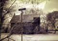
| 01/22/2003 11:06:07 PM |
NOHEL(L)?by GekkerComment: I'm seeing a wierd artifact between the tree and the house - creating a purple effect. Did you change the colours before resizing the image perhaps? Also, the sign is difficult to see, although I understand why you tried to include the trees and the house so much - they really make the picture. |
| Photographer found comment helpful. |
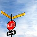
| 01/22/2003 11:04:09 PM |
Roadsign?by jonrComment: Good idea - is this a road sign or not. Don't worry - I definitely consider this on topic. It looks like the sign is bent slightly - that's a shame because as first it looked like a defect in the image (especially the left edge of the sign). Also, the sign is perhaps a little too dark, but it's not too bad |
| Photographer found comment helpful. |
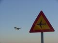
| 01/22/2003 11:00:24 PM |
Traumaby PHOTOCHlXComment: It looks like something bad has happened when resizing this image - the text has become very blocky. Perhaps you could have tried not resizing it as small? Composition is pretty good - although perhaps you could have included the tail of the helicopter completely. |
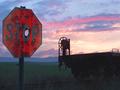
| 01/22/2003 07:08:15 PM |
Drew's Stop Sign Revisited by autoolComment: This is a very picturesque photo - a lovely sunset, a silohuetted rail car and a stop sign that's obviously been target practice once or twice. Colours are great, focus is perfect and composition is wonderful. Well done - one of the best. |
| Photographer found comment helpful. |
Home -
Challenges -
Community -
League -
Photos -
Cameras -
Lenses -
Learn -
Help -
Terms of Use -
Privacy -
Top ^
DPChallenge, and website content and design, Copyright © 2001-2025 Challenging Technologies, LLC.
All digital photo copyrights belong to the photographers and may not be used without permission.
Current Server Time: 08/14/2025 10:33:03 AM EDT.