| Image |
Comment |
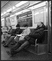
| 01/04/2006 09:41:57 PM |
The Commuteby ngremourComment: I like the black and white, and the graininess is ok as well. Perhaps a more contrasty / dynamic image would be good - curves would have helped deal with the bright lights if doing this. I do like the framing and composition (particularly the nearest person). Good work. |
 Photographer found comment helpful. Photographer found comment helpful. |
| 01/04/2006 09:40:22 PM |
busy Newyork cornerby HalimComment: It's a good shot - and shows busy city life well. My only negative would be the back of the lady in black - it creates a big negative space in the centre of the image, and with the building above kind of divides the image into two. I think a person walking towards you would have been more effective. |
| Photographer found comment helpful. |
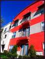
| 01/04/2006 05:26:45 PM |
Urban Livingby JutildaComment: Wow - what bright, saturated colours. Especailly in this challenge, where so many people took the black+white approach. It's a good shot - interesting shapes and good composition. It doesn't make a particular statement, and doesn't show any life, but I still like it. Great work. |
| Photographer found comment helpful. |
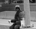
| 01/04/2006 05:25:24 PM |
luck of the drawby DARKSIDEJERRYComment: Nice shot - yet another black+white photo (so many in this challenge). I like the concept (similar to my original plan). My only suggestion would be to try a different composition. The pole and light coloured walkway/roadway draw attention away from the person. Perhaps a more aggressive crop of the person, or a different background would have been more effective. |
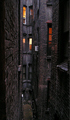
| 01/04/2006 05:21:37 PM |
A Room with a Viewby Herblacklist12Comment: I love the concept, and the title works really well. I would have liked a slightly wider shot if possible, and some more detail visible in the brickwork, but I do like the colours and warmth of the lit window. Good work. |
| Photographer found comment helpful. |
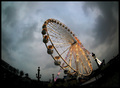
| 01/04/2006 05:19:03 PM |
Paris Wheelby redmoonComment: I love the colours against the gloomy background. This shot really has a lot of atmosphere about it. I might have preferred it without the fish-eye effect, but its difficult to say without seeing it - I think a bunch of the silohuetted lamp-poles towering up would have looked great with it. Good work. |
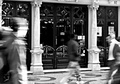
| 01/04/2006 05:16:45 PM |
Caféby pacpintoComment: Nice shot - the building is very crisp so well done on the long exposure. |
| Photographer found comment helpful. |
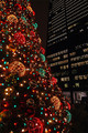
| 01/04/2006 05:12:33 PM |
Christmas in the Cityby milo655321Comment: It's a nice shot, but there isn't a strong focal point. The building in the background does demonstrate "City" well though and is a nice contrast to the colourful tree. |
| Photographer found comment helpful. |
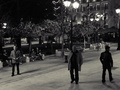
| 01/04/2006 05:11:25 PM |
black and nightby nikantComment: I like this - it meets the challenge topic easily and the black+white adds to the feel of the shot. It's a nice shot. |
| Photographer found comment helpful. |
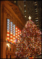
| 01/04/2006 04:54:18 PM |
Christmas on Wall Streetby Nikolai1024Comment: Nice composition and idea - I would have liked to see some people in the shot to help portray "Life". I was in Wall Street back in April - I'm sure it's lovely at this time of year though. |
| Photographer found comment helpful. |
Home -
Challenges -
Community -
League -
Photos -
Cameras -
Lenses -
Learn -
Help -
Terms of Use -
Privacy -
Top ^
DPChallenge, and website content and design, Copyright © 2001-2025 Challenging Technologies, LLC.
All digital photo copyrights belong to the photographers and may not be used without permission.
Current Server Time: 08/14/2025 05:41:16 PM EDT.