| Author | Thread |
Comments Made During the Challenge  |
|
|
01/10/2006 02:27:29 PM |
|
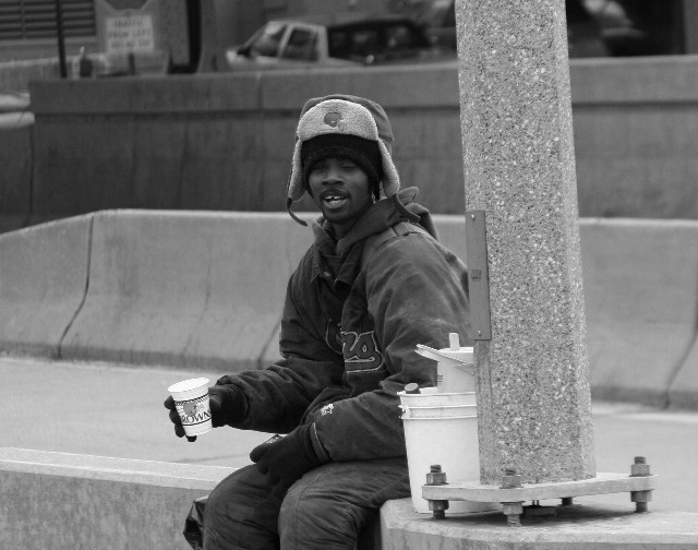
Wondering if it would look a little better if the pole was vertical. Nice subject and title. |
|
|
|
01/08/2006 07:23:44 PM |
|
|
|
01/08/2006 12:48:02 PM |
|
possibly increase the exposure a little and crop the top a bit. Also is the lamp post at an angle or is the camera, I can't make my mind up. |
|
|
|
01/07/2006 11:51:01 PM |
|
Hey, you must be from our area...the Browns. Great capture of street life and perfect title. |
|
|
|
01/07/2006 06:59:34 PM |
|
|
|
01/07/2006 04:01:29 PM |
|
I've seen plenty of pictures like this, at this point, but this one, nonetheless, is good. Nice job. |
|
|
|
01/06/2006 08:36:30 PM |
|
|
|
01/06/2006 05:56:03 PM |
|
I don't understand the title. The image is nice though... very photojournalistic |
|
|
|
01/06/2006 05:30:37 PM |
|
crop so the pole is the right border |
|
|
|
01/06/2006 11:39:41 AM |
|
Interesting portrait but background not very interesting in terms of the city |
|
|
|
01/05/2006 10:36:37 PM |
|
...that he's a Browns fan? Yeah, that's too bad... |
|
|
|
01/05/2006 09:55:20 PM |
|
|
|
01/05/2006 01:03:41 PM |
|
This guy just evokes Cleveland all the way. The image would have been great cropped. The only way this much background can work with the shot is using the rule of thirds ie shifting the subject to the left or right margin. This image would be 50% better if the cropping was flush with the left of the light pole, cut off at the knees, and flush with the top of the wall to hide the parking lot. Just my opinion. Still deserves a 7. |
|
|
|
01/05/2006 12:15:57 AM |
|
Number of Cleveland shots in this challenge..mine was taken in public square, good luck on the challenge. |
|
|
|
01/04/2006 11:38:07 PM |
|
that's the squeegee life all right. I love the ambiguity of his expression, and the (mostly potential) energy of his pose. |
|
|
|
01/04/2006 09:11:21 PM |
|
Dang he likes his football, his cup is even the browns. |
|
|
|
01/04/2006 05:25:24 PM |
|
Nice shot - yet another black+white photo (so many in this challenge). I like the concept (similar to my original plan). My only suggestion would be to try a different composition. The pole and light coloured walkway/roadway draw attention away from the person. Perhaps a more aggressive crop of the person, or a different background would have been more effective. |
|
|
|
01/04/2006 01:40:04 AM |
|
good portrayal of city life. definitely fits the challenge. the black and white works nice here. |
|
Home -
Challenges -
Community -
League -
Photos -
Cameras -
Lenses -
Learn -
Help -
Terms of Use -
Privacy -
Top ^
DPChallenge, and website content and design, Copyright © 2001-2026 Challenging Technologies, LLC.
All digital photo copyrights belong to the photographers and may not be used without permission.
Current Server Time: 07/02/2026 12:35:03 AM EDT.