| Image |
Comment |
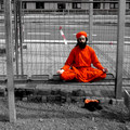
| 05/10/2006 01:25:25 AM |
Where Ever You're At.by tryals15Comment: If you got this image without violating the basic editing rules (ie: selective editing) then well done. I love the title and idea for this image. |
 Photographer found comment helpful. Photographer found comment helpful. |
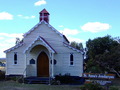
| 05/10/2006 01:16:30 AM |
Reaching Outby ChikaZAWaComment: The border really suits the heavy black lines in the image - well done on an appropriate border. I really like this shot - and such an interestingly shaped building. Well done. |
| Photographer found comment helpful. |
| 05/10/2006 01:14:54 AM |
Moonriseby MiamiFluteComment: Great work - the moon is so subtle (minus the title) and the remainder of the photo has a beautiful simplicity to it. |
| 05/10/2006 01:11:41 AM |
|
| Photographer found comment helpful. |
| 05/10/2006 01:10:06 AM |
ST ANNE,S JONDARYAN QLD AUSTRALIAby corrieComment: It's well composed and the background is nice, however your score will suffer because of the colour. The whole image has a blue shade to it. If you need help understanding how to correct this whitebalance issue just send me a message - its really quite easy to do. |
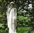
| 05/10/2006 01:08:19 AM |
Looking Out From Aboveby CamComment: I like the composition and cropping. A little fill light on the statue might have helped separate it from the background a bit better. |
| Photographer found comment helpful. |
| 05/10/2006 01:06:53 AM |
|
| Photographer found comment helpful. |
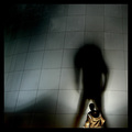
| 02/15/2006 04:57:48 PM |
Without my headby eirasiComment: Greetings from the Critique Club
Technical elements
Technically there is very little wrong with this photo - good sharpness, good colour, good control of a difficult exposure.
Composition
I really like the composition of this shot - only partially including the person (yourself) and having them walk into the frame, away from the camera, works really well. The geometric lines of the panelling and in particular the rivets really provide an interesting, yet non distracting, background.
Border / Title
The border is the ideal colour (black) and even though it's really large I wouldn't specifically say that it is too big for this shot. The title is good.
Personal / Emotional qualities
I'm not sure if not including the head was the original plan or just something you realised once you had taken the first shot. It's ok, but I'm not sure what it's trying to convey emotionally. Personally speaking I would have liked the shot just as much if the head had been included.
Summary
It's a very good shot, and the shadow really dominates as the key element in the photo - which is perfect for the challenge. It is really difficult to say how to improve this shot - there is nothing really wrong with it at all. Good work! |
| Photographer found comment helpful. |
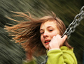
| 02/15/2006 01:40:34 AM |
swinger by ursulaComment: I got to vote on this challenge but run out of time to place comments... I was going to leave you a comment though about this image. Personally, it was #1 in the challenge. A great idea executed to perfection. In particular the hair flowing in the breeze helps confirm the motion, and the colours are lovely and rich. Of course it helps that the girl / lady in the photo has a natural beauty about her. In a word... Stunning. |
| Photographer found comment helpful. |
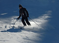
| 02/08/2006 07:41:22 PM |
Skiingby mannjuditComment: I see motion (in the powder) but it doesn't show panning since the ground is crisp. |
| Photographer found comment helpful. |
Home -
Challenges -
Community -
League -
Photos -
Cameras -
Lenses -
Learn -
Help -
Terms of Use -
Privacy -
Top ^
DPChallenge, and website content and design, Copyright © 2001-2025 Challenging Technologies, LLC.
All digital photo copyrights belong to the photographers and may not be used without permission.
Current Server Time: 08/12/2025 11:04:42 PM EDT.