| Image |
Comment |
| 01/12/2003 06:37:48 PM |
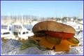
A Parrot Heads Delightby GotchaComment: The focus is very good, and the shallow depth of field works to your advantage (you can see where the photo is, but the main subject is very obvious). The shadow on the burger is a little distracting though and makes it rather dark. Framing is good although the border is perhaps a little unnecessary - the photo is strong without it (perhaps a single blue line would be better - no white). |
 Photographer found comment helpful. Photographer found comment helpful. |
| 01/12/2003 06:10:44 PM |
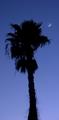
California Dreamin'by liltoolComment: The moon is a very nice touch - very elegant and nicely positioned. It's a shame the tree is slightly blurred in spots - presumably from a long exposure for the low light level. Did you try removing this using "unsharp mask" or some other sharpening filter? |
| 01/12/2003 06:06:46 PM |
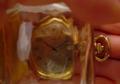
Time in a Bottleby BullwinkleComment: Nice try, however I find the hand slightly distracting from the title of the photo. It also appears to be an out of focus thumb at the top right of the image - this is a little distracting. Perhaps it would be possible to lay the watch on a black surface and sit the bottle on top? |
| 01/12/2003 06:02:55 PM |
hidden placeby annaintheskyComment: This is a quite nice photo. To me it looks like the depth of field is a little narrow - both the foremost and rearmost elements of the photo appear blurred. There is an explanation of DOF (depth of field) under the Learn->Tutorials section incase you are interested (although I realise you might have been limited by the camera used) |
| 01/09/2003 07:08:40 PM |
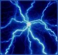
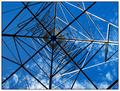
Ice House : Electric Blueby HBunchComment: This is actually quite appropriate to what I remember of IceHouse. If they had an album cover like this I wouldn't have been surprised. Well done - and thanks for explaining what it was. |
| Photographer found comment helpful. |
| 01/09/2003 07:04:11 PM |
|
| Photographer found comment helpful. |
| 01/09/2003 07:00:08 PM |
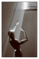
Blinded by the Light by VipermikeComment: I really like this photo the more I look at it. It has a simple stark quality that works really well. It fits the song title very well, yet is interesting within itself (several other photos match the song title but aren't good photo's on their own this week). Well done. |
| 01/09/2003 06:56:58 PM |
"Angel" by Shaggyby gigi922Comment: Great photo - It looks very much like a potential album cover (which I consider appropriate for this challenge). Great lighting and composition. Great subject and great atmosphere / mood. Out of curiousity, what did it look like in colour? |
| 01/08/2003 12:31:10 AM |
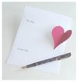
With love..by PaulMdxComment: The image looks a little washed out. Perhaps you were working without enough light. Also perhaps a different background (like a wooden desk) might have made the sheet of paper stand out more. The comosition of objects is good though. |
| Photographer found comment helpful. |
| 01/07/2003 10:42:42 PM |
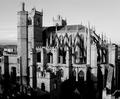
Stairway to Heavenby jjbeguinComment: Wow. Where is this place? It looks stunning. Black and white really works well with such an old building and the lighting conditions you had. Well done. |
Home -
Challenges -
Community -
League -
Photos -
Cameras -
Lenses -
Learn -
Help -
Terms of Use -
Privacy -
Top ^
DPChallenge, and website content and design, Copyright © 2001-2025 Challenging Technologies, LLC.
All digital photo copyrights belong to the photographers and may not be used without permission.
Current Server Time: 08/12/2025 09:05:59 AM EDT.