| Image |
Comment |
| 01/16/2003 08:05:24 PM |
Refreshing!!by BigSmilesComment: It's an interesting photo although the depth of field appears to be a bit shallow - the middle is in focus, but the grass at the bottom looks blurred and the bank at the top is blurred. Without knowing the camera it's difficult to say if there is much you could have done about this though. |
 Photographer found comment helpful. Photographer found comment helpful. |
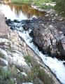
| 01/16/2003 08:02:01 PM |
Stand Tallby TurbotechComment: I love the composition, and the reflection in the water. The tower is a little washed out though. It looks like the lighting was tough though (very bright sky, but very dark around pond). I wonder if a polarising filter would have helped - others would know the answer to this. Well done. |
| Photographer found comment helpful. |
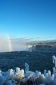
| 01/16/2003 06:28:27 PM |
The Temperature Falls at Niagaraby wargloryComment: Good photo - the colours are rich and the focus is nice. I'm curious as to why you chose portrait instead of landscape though. There is a bit too much sky for my taste and landscape orientation may have pushed the horizon up to about 1/3 from the top. Otherwise though the photo is nice - the foreground is particularly interesting |
| Photographer found comment helpful. |
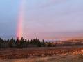
| 01/15/2003 08:17:03 PM |
Our Front Yardby camelotnorthComment: The subject is quite nice, and the rainbow adds a nice effect. I'd love to see this landscape on a clear day - I'm jealous. |
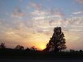
| 01/15/2003 08:12:21 PM |
Landscapeby fsieradzkiComment: The colours of the sky against the silohuette works very well. Focus and composition is very good - quite a nice photo, worthy of printing. Well done. As a suggestion, you could try cropping the right edge to include the power pole, although I would try to keep a landscape perspective to the image. |
| Photographer found comment helpful. |
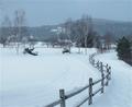
| 01/15/2003 12:19:53 AM |
Snowed Fenceby pauldComment: I like the way the fence snakes away through the photo - lovely composition. The horizon is also at a nice height, and focus is good. You should take the same photo in six months time, I think they'd make a lovely comparison. Good work. |
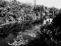
| 01/15/2003 12:18:12 AM |
Nature at it's best ...by CreativeFlyPhotoComment: I find the black and white a little too harsh - especially when the title mentions "nature" - I expected some natural greens and blues. It looks a little like an old photo and has lovely composition but I think colour would have gotten a higher vote from me - I don't see a need for b&w for this photo. |
| Photographer found comment helpful. |
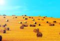
| 01/15/2003 12:15:52 AM |
Hay, thats nice!by MartinComment: Great title and wild colours. It works very well with your chosen subject. Good work |
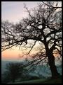
| 01/15/2003 12:14:46 AM |
Silhouette at sunrise.by MarklaneComment: I love this photo. The range of colours is great, the silohuette of the tree is wonderful. It's a very interesting picture, and technically well executed. The border sits well, colours are natural yet interesting, focus is good, composition is very good. Well done - one of the best. |
| Photographer found comment helpful. |
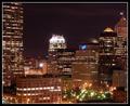
| 01/15/2003 12:07:30 AM |
"Manned Scape"by KickDrum5150Comment: Witty title and pretty good exposure. The framing and composition work well (tall buildings on each edge and some interest in the centre and foreground. Did you have a filter to get the star effect around the lights or is your camera lens naturally gifted - they look very good. Well done. |
Home -
Challenges -
Community -
League -
Photos -
Cameras -
Lenses -
Learn -
Help -
Terms of Use -
Privacy -
Top ^
DPChallenge, and website content and design, Copyright © 2001-2025 Challenging Technologies, LLC.
All digital photo copyrights belong to the photographers and may not be used without permission.
Current Server Time: 08/12/2025 11:27:32 PM EDT.