| Image |
Comment |
| 01/20/2003 07:15:43 PM |
|
 Photographer found comment helpful. Photographer found comment helpful. |
| 01/20/2003 07:14:15 PM |
|
| 01/20/2003 07:11:29 PM |
Sign & Moonby marboComment: Sorry, I don't quite understand the relevance of the moon in this shot. Unfortunately the title doesn't explain it either. |
| Photographer found comment helpful. |
| 01/20/2003 07:10:00 PM |
On the Roadby lionelmComment: Nice subject and composition although the photo is a little grainy. The black is a little washed out (perhaps levels in photoshop could have helped) and the yellow is showing some artifacts. Of course, depending on the camera (and or zoom) used you may have done quite well. |
| Photographer found comment helpful. |
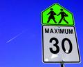
| 01/20/2003 06:21:43 PM |
maximum thirty studentsby ParentxComment: The perspective is great, colours are wonderful and the jet stream is an interesting addition. My question, then, is what are the three white patches on the 30 sign? Are they some kind of reflection or something stuck to the sign? I must say again though - the blue and green is wonderful. |
| Photographer found comment helpful. |
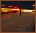
| 01/20/2003 06:17:03 PM |
You judge - did the driver obey the sign?by gmacproComment: Did he stop? Yes, judging by the image of the car stationary. In general the lighting is very good - it's a shame that there is a reflection on the stop sign itself. The brown border is interesting - probably not my first choice but it does kind of suit the snow (which looks brown at the bottom of the photo). |
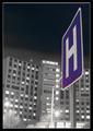
| 01/20/2003 06:13:17 PM |
"Rising Healthcare"by KickDrum5150Comment: The border suits the black and white building well. You certainly did a good job of bringing attention to your sign by washing the rest of the image out. The street lights have a lovely flare, however the St Francis sign looks like there was maybe a little bit of camera shake (just a tiny amount). Composition is good. Good work. |
| 01/20/2003 05:25:14 PM |
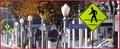
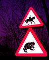
Beware of the Giant Toadby KonadorComment: You've managed to get the colours incredibly vivid in this photo - although I believe it's a totally legal manipulation. The sky is a lovely outcome of this - I really like the colour against the silohuetted trees. The "giant toad" title is also very funny - well done. |
| Photographer found comment helpful. |
| 01/20/2003 05:19:43 PM |
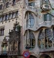
Signs by Antoni Gaudiby bcncrazyComment: What a lovely building (we have no architecture like this in Australia really). You've managed to include a sign although it looks a little out of focus - the main building is focused very well. |
| Photographer found comment helpful. |
| 01/20/2003 05:16:49 PM |
War signby bkumerComment: I really love the background - it says so much. Colours and focus is great. You've also met the challenge theme quite easily. Well done - the best image I've viewed so far. |
Home -
Challenges -
Community -
League -
Photos -
Cameras -
Lenses -
Learn -
Help -
Terms of Use -
Privacy -
Top ^
DPChallenge, and website content and design, Copyright © 2001-2025 Challenging Technologies, LLC.
All digital photo copyrights belong to the photographers and may not be used without permission.
Current Server Time: 08/13/2025 09:36:37 PM EDT.