| Image |
Comment |
| 10/20/2008 09:48:25 PM |
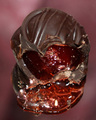
Sweet Surpriseby PikkelComment: Reflection is too strong; hard to make visual sense out of it. The focus is soft. Nice try, but I'd suggest a reshoot, maybe with stronger lighting so you can tighten up your aperture for bigger DOF. |
 Photographer found comment helpful. Photographer found comment helpful. |
| 10/20/2008 09:46:41 PM |
|
| Photographer found comment helpful. |
| 10/20/2008 09:46:06 PM |
|
| Photographer found comment helpful. |
| 10/20/2008 09:43:34 PM |
|
| Photographer found comment helpful. |
| 10/20/2008 09:43:01 PM |
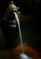
Purgeby roadendsComment: Nicely done: dragging your shutter adds interest to the water; the colors are warm. I like the little bit of spotlight where the fountain meets the pool.
There's a little bit of fin lined up with the eye on our right; I find that a little distracting.
Still a very nice shot. |
| 06/07/2005 11:42:01 AM |
The Long Road Homeby arpboyComment: Originally posted by popdeepop:
Why do I like this? What aperature? Nice low angle. The sky is empty. |
My original is at home, but I believe my aperture was 4.0. I'd have to check. |
| 05/26/2005 12:38:14 PM |
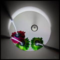
Alien Intercoastalsby BikerGregComment: Very nice. I like the posterization. It looks like oil more than water. Could use a little more of a focal point to draw the eye, however... |
| Photographer found comment helpful. |
| 05/26/2005 12:37:22 PM |
True Gritby scalvertComment: Great humor! I think I might have used a little fill light at the back/left, just to cut the shadow a bit on the wall. |
| Photographer found comment helpful. |
| 05/26/2005 12:36:16 PM |
Angryby lemondsterComment: Got a laugh out of it. I think I would have brought up the contrast a bit. |
| Photographer found comment helpful. |
| 01/19/2004 10:19:55 PM |
Tweakyby Photolover081603Comment: Nice look at your cat, but the background is distracting. The details on your cat are blown out. Background is also too dark against the subject. |
| Photographer found comment helpful. |
Home -
Challenges -
Community -
League -
Photos -
Cameras -
Lenses -
Learn -
Help -
Terms of Use -
Privacy -
Top ^
DPChallenge, and website content and design, Copyright © 2001-2025 Challenging Technologies, LLC.
All digital photo copyrights belong to the photographers and may not be used without permission.
Current Server Time: 08/11/2025 12:19:12 AM EDT.