| Image |
Comment |
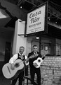
| 05/13/2013 11:50:30 AM |
Mariachi by beatabgComment: Really nice photo. Not sure if the guitar is really that big or edited to appear so. Either way I enjoy looking at the picture. |
 Photographer found comment helpful. Photographer found comment helpful. |
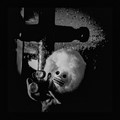
| 05/13/2013 11:49:32 AM |
cheeseby undieyatchComment: It's hard to tell what the doll is holding. I am guessing a camera? |
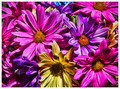
| 05/13/2013 11:48:59 AM |
Flower Fiesta by KelliComment: Fantastic. Great color and saturation that is vibrant but still natural looking. |
| Photographer found comment helpful. |
| 05/13/2013 11:48:29 AM |
Ai Yi Yi Yiby banmornComment: A little too much going on. It looks like the singer is wearing two hats bc of the man behind him. Also a little grainy on the guitar. But I like the eye lines. My view travels nicely from the man in glasses to the singer and then down the mic to the cigarette. I am somewhat distracted by the girl in the right third of the frame though. |
| Photographer found comment helpful. |
| 05/13/2013 11:46:39 AM |
Sinko De Mayoby RyanWComment: Great title. I love that you are having fun with the contest. I also like the asymmetry of the drain vs the symmetry of the mayo. I might have tried to make the mayo labels more symmetrical though. And I think a lower angle would have been more interesting. |
| Photographer found comment helpful. |
| 05/13/2013 11:44:50 AM |
|
| Photographer found comment helpful. |
| 05/13/2013 11:44:15 AM |
Candy Filledby giantmikeComment: Well done. Good colors. Nice bokeh. A little grainy in the corners though. |
| Photographer found comment helpful. |
| 05/13/2013 11:43:52 AM |
|
| Photographer found comment helpful. |
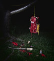
| 05/13/2013 11:43:10 AM |
The Night Afterby jcarComment: It feels violent. Not sure if that was your intent, but it evokes emotion, which is good. |
| Photographer found comment helpful. |
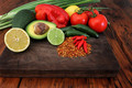
| 05/13/2013 11:42:32 AM |
The Ingredients by StagoleeComment: Instinctively I would prefer the cutting board and chives not be cut by the left edge of the frame. But since framing that way would not be difficult, it made me question why the creative choice was made and I spent more time looking at the photo as a result (which is a good thing). I like the color scheme, the wood tones really pop nicely. My only criticism is that the photo seems a little unbalanced to me. Maybe it is the crop, but I could've used an element at the bottom right of the frame, maybe a stray pepper or a knife tip. |
| Photographer found comment helpful. |
Home -
Challenges -
Community -
League -
Photos -
Cameras -
Lenses -
Learn -
Help -
Terms of Use -
Privacy -
Top ^
DPChallenge, and website content and design, Copyright © 2001-2025 Challenging Technologies, LLC.
All digital photo copyrights belong to the photographers and may not be used without permission.
Current Server Time: 08/02/2025 02:02:12 PM EDT.