| Image |
Comment |
| 06/02/2004 06:58:58 PM |
Lane 3by ZoomdakComment: Nice composition with the track lines! I think I would have preferred either a shorter shutter speed to have a crisper focus on the athlete, or a much longer one to have more sense of speed. 7 |
 Photographer found comment helpful. Photographer found comment helpful. |
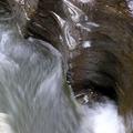
| 06/02/2004 06:50:05 PM |
Untitledby andywightmanComment: This must be John... I like these water shots a lot! The spot in the upper right corner is a bit distracting, it doesn't seem to fit the texture of the rest of the photo. Great shot though. |
| Photographer found comment helpful. |
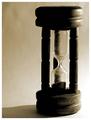
| 06/02/2004 06:47:22 PM |
Three Minutes Are Goneby mocabelaComment: As a picture it is very nice: good lighting, good composition, good focus except for the blurred top. The fogged up glass is slightly distracting. The link to the challenge is weak at best, without the title there's nothing that makes this say 'three' unless you happen to be able to guess how long this amount of sand would take in an hourglass. |
| Photographer found comment helpful. |
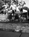
| 06/02/2004 06:42:33 PM |
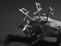
Entertaining Trioby indianzfanComment: Nice photo! Minor detail: you chopped off the right foot of the left guy. The focus seems a little bit soft, or is that movement blur? I like the colors! |
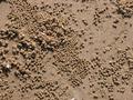
| 06/02/2004 06:21:12 PM |
Sand's Eggby aromiaComment: I don't see anything three-ish in here. Also, colors are very dull. The only thing interesting here is the texture, but because the focus is rather soft I don't see much detail. |
| 06/02/2004 06:19:19 PM |
|
| Photographer found comment helpful. |
| 06/02/2004 06:15:16 PM |
last one down...by theodor38Comment: This is so real I can almost smell the smoke. I hate smoking, but I won't vote you down for it. Having the filter edges aligned would have made it perfect. 9 |
| 06/02/2004 06:12:24 PM |
wounded bullby GinaRothfelsComment: I think this would have done better with a lighter background, to make the bull stand out more and have better focus on the texture on his skin. |
| Photographer found comment helpful. |
| 06/02/2004 06:11:26 PM |
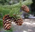
Coneheadsby vtruanComment: Nice composition, colors seem a bit flat. The blue edge at the bottom is really distracting! |
| Photographer found comment helpful. |
| 06/02/2004 05:58:28 PM |
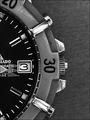
Tick, Tick, Tickby sleekrComment: Took me a while to figure out the moving hand. It's not obvious enough, it looks like a watch picture. Not a bad watch picture, but still just a watch picture. I do like the slight graininess. 7 |
| Photographer found comment helpful. |
Home -
Challenges -
Community -
League -
Photos -
Cameras -
Lenses -
Learn -
Help -
Terms of Use -
Privacy -
Top ^
DPChallenge, and website content and design, Copyright © 2001-2025 Challenging Technologies, LLC.
All digital photo copyrights belong to the photographers and may not be used without permission.
Current Server Time: 07/18/2025 08:27:25 AM EDT.