| Image |
Comment |
| 10/23/2013 12:42:38 AM |
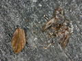
when the leaves are fallingby TiberiusComment: I always try to drop a comment on the shot that had the greatest disparity between my vote and the place it received. Sadly you get this challenge's comment. I loved the density of textures and the solidity of the leaf in contrast to the sublimation of the bird, all hanging together in the same tonal range. It seems my enthusiasm was misplace. I thought this was a great shot. Keep it up. |
 Photographer found comment helpful. Photographer found comment helpful. |
| 10/05/2013 01:39:48 PM |
After Date Coffeeby HornOUBetComment: This shot is everything I was looking for in an entry and more. Sadly the coffee cup is the more, and it steals so much of the thunder here. Had it only been a touch lower it would have been a great shot, but it is such a strong element that is saps a great shot. Everything else from the subject to the lighting to the editing is perfect. |
| Photographer found comment helpful. |
| 10/05/2013 01:33:37 PM |
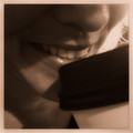
Future Mrs. by MinsoPhotoComment: I wish the DOF was just a bit wider. It is a lovely shot but the focus pulls attention to the glasses and the eyes, while the mouth is just a bit fuzzy, so it is a better shot tit may get credit for in this challenge. If you had been another stop or two open, it would certainly have ribboned. |
| Photographer found comment helpful. |
| 10/05/2013 12:47:24 PM |
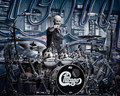
The Fabulous Tris Imboden by cynthiannComment: It's funny how some images are just worth going back to over and over. I liked the capture before the edit, I like this edit more and thought it would do well. Since it has been hanging out on the front page I keep giving it another look, and it rewards that attention every time. The ribbon is nice, but this is just one of those shots that works on so many levels that it just gets better on repeated viewings, and that is a very rare thing. |
| Photographer found comment helpful. |
| 10/03/2013 01:44:38 PM |
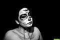
Day of the Dead Face Paintby CtuiteleComment: Did you use a second flash in this? Classically the second flash in such a setup is back left as a hair light or rim light to separate the subject from the background, and with the amount of inky background that would have been a big help.
Or it would be used front right as a fill light to lighten up the big shadows thrown by the main light, particularly that thrown by the models chin and nose which have become strong compositional elements.
If I was diagramming this shot I would want both secondary lights in the shot, and since I only have 2 flashes I would have used a constant light like a cheap clamp lamp to provide the rim light, and used my flashes as key and fill, with some sort of modifier on the key light to soften the shadow edge, be it an umbrella, a Stofen(which rarely comes off my main flash) or a piece of paper towel draped over the flash. Anything you can do to diffuse the flash is good in this setting to keep the viewer's eye on the subject and not get them thinking about how you lit the scene. Message edited by author 2013-10-03 13:45:53. |
| Photographer found comment helpful. |
| 10/03/2013 01:31:18 PM |
Chino Hills, CA - Weddingby CtuiteleComment: A solid shot with a few niggles. I think you missed the framing slightly. Had you shot looser you could have cropped in to center the arch exactly, having more black on the right and the left is a distraction from the action; likewise having lots of shadow above the arch but cutting off the bounce on the floor steals a bit of thunder. If you had been able to get that arc of bounce light completed instead of cutting it off with the bottom of the frame, it would have been a lovely complement of the main arc, and created a truly complete static frame for the main action.
The color space looks a bit yellow green. It could be that you were going for an antique look for the album so it may be intentional, but in presenting single images people will assume it is an error if your whites are not balanced.
|
| 10/01/2013 05:37:46 PM |
The Shedby AmmieComment: those trees in the upper right are pretty distracting, and so differently lit than the moody misty barn that this looks like a battle between one composition and another. |
| Photographer found comment helpful. |
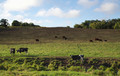
| 10/01/2013 05:34:54 PM |
Black and White in the Pastureby giantmikeComment: This one has all the elements and is technically fine, but it lacks a strong central element. The cows are too strong to be elements in a landscape, but not close enough to be the point the eye focus on. I want to like this more than I do, but the whole seems to add up to less than the parts. |
| Photographer found comment helpful. |
| 09/30/2013 04:19:25 PM |
|
| Photographer found comment helpful. |
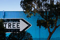
| 09/30/2013 04:16:26 PM |
Tree by sfaliceComment: Way to go Alice! Nice capture of a hard to get sign. It looks so easy driving by, but not so easy when you frame it up; this is a great capture |
| Photographer found comment helpful. |
Home -
Challenges -
Community -
League -
Photos -
Cameras -
Lenses -
Learn -
Help -
Terms of Use -
Privacy -
Top ^
DPChallenge, and website content and design, Copyright © 2001-2025 Challenging Technologies, LLC.
All digital photo copyrights belong to the photographers and may not be used without permission.
Current Server Time: 08/04/2025 07:47:57 AM EDT.