| Image |
Comment |
| 06/05/2006 03:47:24 AM |
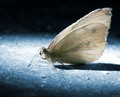
Moth On the Floorby stare_at_the_sunComment: the quality of the picture itself is super, and the way you've done the post processing is very likable. it just doesn't say "empty room" to me in any strong way - though i imagine any sort of macro shot would have the same difficulty. but's it's still quite lovely, and the blue tones are very very nice. 7. |
 Photographer found comment helpful. Photographer found comment helpful. |
| 06/05/2006 03:42:16 AM |
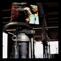
Modern Torch Songsby gsalComment: this is just very weird - the record sleeve is completely out of context with its surroundings. even more weirder is that it seems to work exceedingly well - this itself would make a glorious album cover. with regards to meeting the challenge, i could be a bit pernickity and mention that temporary props aren't actually part of the room... but that's just me being excessively stupid. i think the post-processing is fantastic and the slightly bonkers thinking behind it is to be saluted. the only real slight complaint is that i would have liked to see the sleeve a little less stuck at the top of the shot. overall - 9. |
| Photographer found comment helpful. |
| 09/29/2005 02:34:15 PM |
|
| 07/04/2005 03:09:39 AM |
Serenityby sheapodComment: 107th? totally shocked; had this down for a top ten from the moment i saw it; totally gorgeous and my favourite of the week. keep at it! |
| Photographer found comment helpful. |
| 06/30/2005 03:06:31 AM |
Healthy Biteby muggle_girlComment: i love the concept of this, and the look of the fork with the apples juice at the tips looks lovely. the only negative thing i would add is that i think a closer crop at the top might work better, possibly as far down as taking out the top half of the piece of apple. the contrast of the black against the to of the apple feels too heavy, and detracts form the super detail you've captured in the rest of the image; seeing the brushed metal of the fork is exspecially pleasing. 7. |
| Photographer found comment helpful. |
| 02/02/2005 05:03:01 PM |
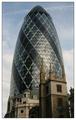
Towersby ManicComment: and me too, i also took a number of shots from exactly the same position one lunch on the way back to the office. in fact, it was almost the same time of day (at about 1.05pm), but three days earlier on the 19th. when i was taking them, i did see another guy in a suit doing the same sort of thing - i assume you didn't try a rehearsal then, did you??
i also tried the stone facade of an old building in front of Lloyds on the other side of the street, but that was naff. my view from here wasn't nearly as sharp as yours (still learning the beast that is the 20D). i guess it was a slightly obvious shot (i have no imagination, and settled for a swiss re shot anyway), but it conveys the theme and technically a total whiz. |
| Photographer found comment helpful. |
| 01/31/2005 04:48:02 AM |
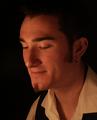
Portraiture by Candle Lightby alien2thisworldComment: other than the title, it would be impossible to tell your method of lighting - indeed, the light feels oddly cold for something coming from a natural flame. though it doesn't bother me, i fear you might get a bit of a bashing for your model not showing his eyes (apparently it's rule #1 in portraiture). it's nicely composed, but it doesn't really get much emotion / feeling out of me. 6. |
| Photographer found comment helpful. |
| 01/16/2005 05:52:22 AM |
P6180866_x2.JPGby coldaComment: i second sams estimation, if not in higher esteem. a lovely shot rich in atmosphere. |
| Photographer found comment helpful. |
| 12/15/2004 09:43:13 AM |
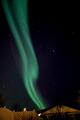
Electric Stormby tyrkinnComment: are northern lights moved by wind? i thought it was more to do with magnetic fields or other mystical things... anyway, there have been too many of these type of shots of late, and they're beginning to lose their appeal / originality. The fact that yours has nice bright, clearly visible stars should be congratulated, but this is offset by the inclusion of the rooftops, which i fear are too distracting and add nothing to the composition. 4. |
| Photographer found comment helpful. |
| 12/15/2004 09:32:19 AM |
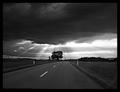
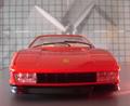
Wind Tunnel - Aerodynamicsby saintnicholas_25Comment: one wonders why any manufacturer, especially Ferrari, would want to check the aerodynamic performance of the rear of the car... HOWever, conceptually i like this very much. It would be preferable if the nose of the testarossa was in focus, rather than the windshield, but on the whole, a pretty good shot, with a cool background and it's very creative. 6. |
| Photographer found comment helpful. |
Home -
Challenges -
Community -
League -
Photos -
Cameras -
Lenses -
Learn -
Help -
Terms of Use -
Privacy -
Top ^
DPChallenge, and website content and design, Copyright © 2001-2025 Challenging Technologies, LLC.
All digital photo copyrights belong to the photographers and may not be used without permission.
Current Server Time: 08/18/2025 10:34:39 AM EDT.