|
|
|
Showing 451 - 460 of ~979 |
| Image |
Comment |
| 06/16/2006 08:55:43 AM | Shadow in the skyby marvinComment: i'm bumping this up from a 2 to a 4 - in retropect i think i was a bit harsh. i personally don't think this is a shadow, more a silhuoette, but even though it slightly hurts my eyes looking at it, i am apreciating the drama in the shot more. i like the undefined appearance of the sky, and i like the weirdness to the egdes of the birds wings. it's a bit mad, really. |  Photographer found comment helpful. Photographer found comment helpful. |
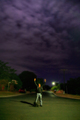
| 06/16/2006 08:50:46 AM | Shadows of WHY!by JudiComment: can't decide between a 6 or a 7 on this. the sky is fab, though i don't think it should really take up 75% of the frame as it does detract from the man and his dog. i do like most of the post-editting - the tones, colours, and feel is really absorbing. for the most part i like the lighting (especially the single lamp) but i think it might be a bit heavy on the diffuse glow. i also wonder why you didn't take a minute to make the shot a bit less wonky, or even cropped closer to your subjects... it has so much promise, it's very creative, and even though he's destressed, somehow amusingly over the top. i'll err on the side of caution and give it a 7.
as a footnote i can't stop wondering how it might be improved if you knocked out the dog by bopping him on the head, and then the man could be pining for the mutt - but that's just my sick brain, so ignore it. | | Photographer found comment helpful. |
| 06/16/2006 08:42:11 AM | Early morning shadows.by banditComment: undoubtably a very pretty shot. it's sitting on the cusp about whether or not it meets the challenge; from the rays of light it's clear shadows are being cast, it's just you don't get to see any of them (i personally don't think silhuoettes are the same thing). it is a fantastic sky though, and the detail of the trees outline is nicely captured. i wonder if you tried shooting closer to the trees and with your back to the sun... 6. | | Photographer found comment helpful. |
| 06/16/2006 05:32:35 AM | Shadow of Hopeby bryantbusComment: one of the seven shots i gave a 10 this week. there is so much i love about this. the optical illusion works brilliantly, and is very convincingly done - took a while to figure out how you did it. it's very funny (NASCAR and cooking?!). with the warm red background and the, erm, pleasantness of the shape cast by the shadow, rather sexy too. lighting, composition, loads of other stuff i don't even know about, is all perfect. it's one of the best examples of challenge fitting i have seen. very well done! | | Photographer found comment helpful. |
| 06/16/2006 05:04:23 AM | High Five for Árniby MajankaComment: i think that by taking a used, old, repeated idea but doing something creative and different to it, itself becomes creative and new. anyone who automatically gave this a sub-par vote or dimissed it on this basis is probably a bit of a moron - the fact that you even cite someone else in the title makes it clear that it's an homage, and it should ideally be considered as that. to me it's visually striking, simple, clean, and expertly taken. the whites are very lovely. the only slight misgiving i would have with it is that it doesn't really scream to me, this was taken with a single source of light. but then that's lust me being picky and not very technically adept. i like it as a piece of art, and would have scored it an 8. | | Photographer found comment helpful. |
| 06/16/2006 04:32:28 AM | Shadows of Childhoodby shalrathComment: this is quite surreal, a bit bonkers, very striking, superbly moody, and very very likeable. there is so much to love about this shot. the colours of the tiles, the lighting, the choice of subject, the colours, tones and feel of the back wall. the shadows aren't quite obviously apparently integral to the shot, but they do convey some meaning the more you study it. the only thing seriously letting you down is the light coming from (and presence of) the property in the background - just screws up the balance and i'm sitting here, cursing you for not moving / rotating round a little bit to get it out of the frame. it's one of those things that easy to miss when you're actually taking a shot because your attention it naturally on the subject at hand. like i said though, very striking image. 9. | | Photographer found comment helpful. |
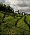
| 06/16/2006 04:16:57 AM | Old Fenceby tfarrell23Comment: i like this as a picture a lot - it's very appealing. it's a mix of things, really; the lush greens, the shape the old rickety fence, the way it leads your eyes along the hill... nice sky too. i think the trees are a bit unfortunate in that they exist there, but save attacking them with an axe i guess there wasn't much you could do about them, and at least you scooted down enough to minimise the impact in the background. the shadow element doesn't really hold enough interest, though, which given the challenge i thought should. for me, this brought your score down from an 8 to a 7. sorry | | Photographer found comment helpful. |
| 06/16/2006 04:10:11 AM | Sail Imagesby DrakeComment: the best thing about this shot is the clever use of depth of field - i like how the water in the foreground is out of focus - it works with the image well and almost give the impression that it could be a small scale model. i also like the moment you captured the boat; its tilt does convey a good sense of movement. another good bit is the silhouette of the guy behind the black sail; it adds interest and makes you wonder what he's up to.
i feel it's suffered though by the crop at the back - having the end chopped off makes it feel visually unbalanced. the lighting on the hull could be improved with a bit of post process brightening. and i hate to be one of those people, but it doesn't really suit the challenge. any shadows there are incidental, rather than integral, to the picture. | | Photographer found comment helpful. |
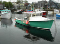
| 06/16/2006 03:59:25 AM | Krystal Marieby GallatinComment: this could look nice hanging on a wall in a fish and chip shop, but really, there is too much going on in this shot; it feels far too cluttered. if you could crop out the boat on the far left, and use the burn tool liberally on the background to make the green boat stand out a bit more, i think that could work quite well. or even do a 50% desturation on everything but the green boat?? and i'm sure a few people have mentioned reflections not being shadows, so i'll drop it there. | | Photographer found comment helpful. |
| 06/16/2006 03:54:03 AM | My Favorite Bookmarkby Morry32Comment: it's a pity that this has now been so overdone; it's obviously an homage to a great concept, but i don't honestly think it adds anything new to the idea. composition wise it also appears a little off-kilter, like it's almost centered but isn't quite. i do find it interesting that it's spanish(?) on one side and english on the other - it's a good choice of pages. but overall, didn't really stir the soul - 4. | | Photographer found comment helpful. |
|
Showing 451 - 460 of ~979 |
Home -
Challenges -
Community -
League -
Photos -
Cameras -
Lenses -
Learn -
Help -
Terms of Use -
Privacy -
Top ^
DPChallenge, and website content and design, Copyright © 2001-2025 Challenging Technologies, LLC.
All digital photo copyrights belong to the photographers and may not be used without permission.
Current Server Time: 08/17/2025 02:28:38 AM EDT.
|