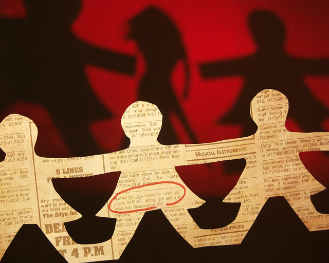
This was hard to do.. I wish you could read the ad more but to get the whole image in it was hard to make work. This took a lot of time, but I can maybe use the techinques for something else. I was fun.
Ok 1st I got the idea, went to the news paper and found out no personal ads? Crap so I make on taped it to the paper, scanned the whole thing fixed it in photoshop. Added a red yellow tent. Printed it out. Layed it on a light table so when I cut it out the words would be in the right place. Put the red cercile around the ad. taped clear fish line to the back and tyed them up in the studio. Then did the cut outs in back out of black paper. Layed a red gel on a overhead projector and put the black cut outs over the jel. My frist shot used studio flash-crap no shadow. Used just a moddle light and it worked. The moved around until I got a shot I liked. This shot took me 5hrs and 2 trips to Wal-Mart.
Statistics
Place: 35 out of 154 Avg (all users): 6.0929 Avg (commenters): 7.5000 Avg (participants): 6.0000 Avg (non-participants): 6.1491 Views since voting: 1107 Views during voting: 296 Votes: 183 Comments: 19 Favorites: 1 (view)
Wow! I am amazed by the creativity and effort put into this photograph.
The only nitpick I have is: The red circled text draws attention to what is written inside the circle, which somewhat distracts the viewer. I feel that the creative use of shadows stands out on its own, and does not need the circled text to make an impact.
one of the seven shots i gave a 10 this week. there is so much i love about this. the optical illusion works brilliantly, and is very convincingly done - took a while to figure out how you did it. it's very funny (NASCAR and cooking?!). with the warm red background and the, erm, pleasantness of the shape cast by the shadow, rather sexy too. lighting, composition, loads of other stuff i don't even know about, is all perfect. it's one of the best examples of challenge fitting i have seen. very well done!
I like the ad on the the person ont the right. "For Sale Silky male, 2 females." creative shot to have different shadows in the background, but it did take me a a couple looks to get to that because of so many words in the foreground.
I like the use of negative space in the cutouts and the way they form shadows. I'm still scratching my head over how you got the center shadow, which bears no relation to the object casting it. I hope you'll explain this when the competition closes.






 Add photograph to your favorites
 Add photographer to your favorites

 Photographer found comment helpful.


