| Image |
Comment |
| 06/23/2006 08:18:13 AM |
Jewels of Denialby johansecComment: it's nice as a still life, but i can't quite see why it would warrant a thirty second exposure - i think in terms of the challenge that the shot should be obvious. it also appears a little too cluttered and messy; maybe fewer pieces would enhance the overall impact? |
| 06/23/2006 08:14:10 AM |
Movie Theater Stair and Railby robinsphotosComment: i like this a great deal and gave it a 9. i especially love the rich bold coluors, and the way the lines draw you to where the stage / screen might be. you should be applauded for finding something beautiful where most people wouldn't see it. |
| 06/23/2006 08:09:36 AM |
Time is Goldenby fotomann_foreverComment: the best things about this is the colours and the veyr high level of detail. the slight feel of diffused lighting is nicely subtle and works pretty well. main problem is i can't quite understand how a longer exposure enhances the picture; just doesn't say the shutter was open any longer than normal, really. the crop is also a bit cramped and i think the overall impact suffers a little as a result. it's okay, but lacks that special oomph. 5. |
 Photographer found comment helpful. Photographer found comment helpful. |
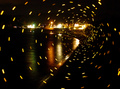
| 06/23/2006 08:01:03 AM |
Beach Vortexby charliebakerComment: how the bloody hell did you do this?? it's very clever... the only reral criticism i have is that the lights from the buildings are a little blown, but that's relatively minor. the vortex itself is genius, and the reflections in the water are very pleasing. impressed. 8. |
| Photographer found comment helpful. |
| 06/23/2006 07:53:39 AM |
Specterby JSAYBComment: some noise reduction, a fiddle with the levels, upping the contrast and lowering the brightness might make this appear a little less undefined and washed out. a lower f number on the aperture might also hide more of the slopdges that appear to be on your lens or sensor. |
| Photographer found comment helpful. |
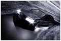
| 06/23/2006 07:50:26 AM |
Back to the Futureby glodaComment: this is sooper groovy. the slight bit of blur on the car (specifically on the rings and the front number plate) are the only things stopping audi phoning you up to put it in the a8 brochure. totally intrigued by how you achieved the wavy lines, as it gives a fantastic impression of speed and gives the car tremendous presence. the lighting, angle, colours, crop, subject matter are all fantastic. it also makes good use of the 30-sec exposure element of the challenge. very easy 10. |
| Photographer found comment helpful. |
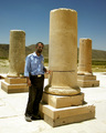
| 06/23/2006 07:45:51 AM |
Persepolis or Takhte Jamshidby kombizzComment: this is possibly one of the stranger submissions this week... given that it seems to be taken in sunlight in a desert, the technical skill involved in getting a good quality snap with a 30 second exposure must be commended. the colours are very nice. not too sure about what is going on though - it feels like something from an academic text book, or a holiday snap from a security guard. i like it in that i'm perplexed as to what to make of it. the grooves in the columns are interesting, and i do wonder if there is a story behind that. but generally, i get the unfortunate impression that you accidentally submitted the wrong photo. gave it a 4. |
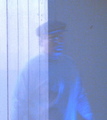
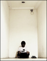
| 06/23/2006 05:43:41 AM |
Psychogenic Incorporealityby blackenedwhiteComment: this is great due to a number of reasons. principally is its unabashed artsy almost pretentious feel which is superb. it's a very dark, moody gallery friendly image. the white room, the use of negative space, the noise in the image, it all combines to make a very effective shot. and the facelessness is just the crowning glory. 9. |
| Photographer found comment helpful. |
| 06/23/2006 04:32:33 AM |
On the Canby danthesquidkidComment: fantastic concept, just not brilliantly captured as i think the softness of the image is going to not find many friends at least in respect of tthe voters. but i think in this case, it's probably wrong to dismiss it on that account. as a form of art, i think the softness, the wonky angle, and bad lighting works in its favour. makes it more cheeky and amusing really. and it adds a degree of humdrum normality and reality about it, which is surreal given the stick character on the seat. actually this is quite inspiring, the more i look at it, the more it's qualities are more apparent. seriously deserves a 10. |
| Photographer found comment helpful. |
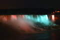
| 06/23/2006 04:07:02 AM |
Niagaraby Rando D300Comment: very good application of a long exposure shot. thuogh given how the colours in the fall are very wonderful, and how the rocks in front are so nicely illuminated, one can't help wonder how it would look with a little less black sky, as it feels quite oppressive. i think losing the top half of sky and a squarer crop might have emphasised the best bits here. still, very pretty and quite mesmerising. 8. |
| Photographer found comment helpful. |
Home -
Challenges -
Community -
League -
Photos -
Cameras -
Lenses -
Learn -
Help -
Terms of Use -
Privacy -
Top ^
DPChallenge, and website content and design, Copyright © 2001-2025 Challenging Technologies, LLC.
All digital photo copyrights belong to the photographers and may not be used without permission.
Current Server Time: 08/17/2025 12:44:15 AM EDT.