| Image |
Comment |
| 07/27/2006 03:32:29 AM |
My Father's Shirtby mrezaComment: i really love this. the partially soft focus makes this very dream like, and gives a strong feeling of non-staticness. i can see this picture being at home in a gallery. the lighting is interesting, with a nice mix of light and shade, and it also fits the challenge very nicely. the only thing i'd do different is crop a little off from the top; i think it might balance the composition a little more. other than that, excellent - 9. |
 Photographer found comment helpful. Photographer found comment helpful. |
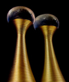
| 07/26/2006 01:37:28 PM |
Alien Towersby levyj413Comment: excellent choice in subject! wife has a bottle of j'adore - didn't occur to me to use it in the challenge. i love the viewpoint, and the suggestion from the title it might be a shot of an alien city. it works... i feel having a black background is a bit of a missed opportunity - a print of a galaxy, martian landscape or even lightning between the tops might have added it's sci-fi ness a bit. but still, great macro and great fun. 8. |
| Photographer found comment helpful. |
| 07/26/2006 01:30:46 PM |
Very Young, Very Goldenby magnusComment: aside from the fact that mum looks like shes having a nap, this is a pretty cute family-type shot. to be honest, the mum is not really needed in the meeting the challenge sense - the ginger sprog could have carried it off on his own, methinks. i think also it might be cropped a tad close to the subjects; some space round them might be nice. still, very sweet and immensely likeable. kids expression is brill! 7. |
| Photographer found comment helpful. |
| 07/26/2006 01:26:35 PM |
Masquerade...by macrothingComment: i think this your entry is suffering a little from the restrictive limitations of picture size - i think this would look fantatsic blown up poster size. i love the out of focus elements, it really adds a depth of mystery and the overall feel is tastefully abstract. the fact that i couldn't tell what it was lust adds to it; afterall, what good is a mask at a masquerade without the mystery? it fits the challenge very well, and is creative and certainly a brave entry. best of luck to you - 9. |
| Photographer found comment helpful. |
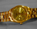
| 07/26/2006 01:23:26 PM |
Gold Watchby albc28Comment: never saw a peugeot watch before - how splendidly cool! the grey background does a good job of enhancing the gold in the picture, but there's a few compositional elements that make it less appealing - the side shot doesn't really work. if the watch was laid flat, and rotated 90 degrees counter clockwise, i think it might look better. it also needs to be sharper, really. 4. |
| 07/26/2006 01:19:46 PM |
Thunderheadby tateComment: it's a very good (but badly poured!) action shot - though if this were served in a pub i'd send it back! but this is dynamically interesting and has a lot going on without detracting from the main subject. i love the background, the nice very clean reflective surface. the lighting is great, and it's making me thirsty. 10. |
| Photographer found comment helpful. |
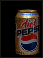
| 07/26/2006 01:16:58 PM |
No Caffeine, No Sugar, No Purpose!by BugzeyeComment: it looks a bit dark overall - the lighting might be better directed to the front of the can rather than the top recess... for me, it generally lacks that oooooh factor; i think the backgound is too uninteresting too - a brighter colour or some sort of cityscape might add some interest. it's a reasonable product shot. 4. |
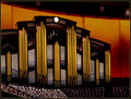
| 07/26/2006 08:47:26 AM |
Organ Pipesby rjksteschComment: this has so much promise for being a super dynamic picture, not just a rather excellent shot. a less tall more panoramic crop would enhance the overall mix of lines and colours, i think - by doing away with the people, and anything above the top of the clock, would really maximise the rather gorgeous architecture and design. though, to be fair, the people do give a jolly good sense of scale, so maybe my crop idea is dumb. it's a great picture though - 9. |
| Photographer found comment helpful. |
| 07/26/2006 08:43:41 AM |
The Golden Eskimoby Ragga2000Comment: the mix of gold and eskimo is certainly creative and original - i've personally never come across it as a theme before... to be honest, i can't quite see whether there is a valid link between the two, but ho hum. the shot does have the unfortunate feel of decapitation about it, too. it's a mad hotch potch of an image to be sure, but still very likeable, particularly for its slight bonkers-ness. erm, 6. |
| Photographer found comment helpful. |
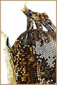
| 07/25/2006 02:49:07 PM |
All That Glittersby hideoutComment: looks kinda abstract - can't tell if it's a dress or bag. i think the material would have made a fantastic macro, but really feels a bit too fussy to completely enjoy. not sure what's happening on the left hand side either. 4. |
| Photographer found comment helpful. |
Home -
Challenges -
Community -
League -
Photos -
Cameras -
Lenses -
Learn -
Help -
Terms of Use -
Privacy -
Top ^
DPChallenge, and website content and design, Copyright © 2001-2025 Challenging Technologies, LLC.
All digital photo copyrights belong to the photographers and may not be used without permission.
Current Server Time: 08/16/2025 01:53:18 PM EDT.