| Image |
Comment |
| 08/08/2006 06:53:53 AM |
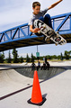
Show Offby LERtasticComment: the cone is an obvious distraction; if it wasn't so bright it might make a good symmetrical counter device type thing to the lad in the air. but being such a lurid orange, i just find it overpowering and is vying equally for attention with you main subject. it really would have been worth cropping just a millimeter above it. i like the presence of the bridge though, it complements in terms of colour, angle, and it helps convey a greater sense of height achieved by the skate boarder. top half = 9, bottom half = 5, so an average of 7 |
 Photographer found comment helpful. Photographer found comment helpful. |
| 08/08/2006 06:49:19 AM |
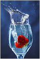
Splash!!by LalliSigComment: it's a great picture, though the fact that it's been done before (complementary colours i think) lessens the immediate pazzazz of the shot. the timing is impeccable; the splosh of water out of the top of the glass is super. and the colours are nice, bright, bold and tasteful. it's very likeable; 8. |
| Photographer found comment helpful. |
| 08/08/2006 06:46:03 AM |
Breaking Pointby bertiebassetComment: this is a very striking shot; it particularly stood out from the other thumbnails... the luminosity of the bulb is one of the factors that give this the Wooooh factor that a lot of the other bulbs have - it almost looks like it has liquid within it. it's let down slightly by the harshness of the bayonette fitting at the top, but other than that, very effective and well done on the exquisite timing. 9. |
| 08/08/2006 03:54:36 AM |
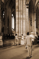
Breathtaking Architectureby indy79Comment: i'm not sure stopped motion is defined by taking a photograph of something not moving... ignoring the challenge implications, it is a nice picture overall, though the sepia tones do seem a bit light and flat to me... it's also a pity that we don't really see what the guy is looking at; oh we get a sense of some massive cathedral type place, but it seems like he's looking at stuff more interesting than what's in the frame (which is predominantly filled by the middle massive column, which due to it's lightness in shade over powers a bit)... 6. |
| Photographer found comment helpful. |
| 08/08/2006 03:41:57 AM |
S-P-L-A-S-Hby xXxscarletxXxComment: yes, i'm sure you're being told this has been done a millions times before, but i'm sure it's still a bugger to acheive so power to you for having a go. it's oddly striking for something whose concept is so familiar; i think the bright bold purples really enhances the style of the shot. i might have wanted it to be an inch lower (the top of the splash feels a bit squished in) but other than that, very nice. 7. |
| Photographer found comment helpful. |
| 08/08/2006 03:39:01 AM |
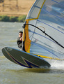
Wind Poweredby tmhallingComment: i like this one muchly; it has a great sense of speed, direction, movement and motion - it's a very alive picture. crop, presentation and composition are all very nice as well. the only thing i might change is make the colours appear a bit less flat by using curves (if you have them), levels, dodge, burn and all those. but other than that, this has been very well captured. 8. |
| Photographer found comment helpful. |
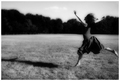
| 08/07/2006 09:15:29 AM |
the rain danceby gurlwithapenComment: this fits the challenge nicely, and it's nicely composed. i do feel that the contrast and diffuse glow is a tad excessive (the trees seem too oppressively dark and the glow has left an off putting halo around the girls arms and head). but i like it muchly; the style is happy and carefree, which is somehow enhanced by floaty skirt and the lack of shoes (nice touch!). it's a warm feeling shot... i like the greyscale, i do, but i'd like to know how it looks in colour... 8. |
| Photographer found comment helpful. |
| 08/07/2006 08:57:16 AM |
Turning on the Waterby Shy ClickerComment: it is a good example of timing, but i think it is suffering from a number of odd-composition related things... i feel that the stopped motion bits do not fill enough of the image, and seem almost insignificant as a result. the lighting is a bit dark and tinged with blue (in Elements or similar colour variations or hue / saturation adjustments might have helped). finally, the image is too small as well; use save for web to get it to the best quality at the allowable dimensions. 3. |
| Photographer found comment helpful. |
| 08/07/2006 07:14:13 AM |
One Momentby ralphComment: excellently dramatic picture! i love the geomtric nature of the lighting in the background, the lovely luminosity of the green spherical thingy, and the capture of the motion of the water is all brilliant. the only slight thing not giving it a ten for me is the odd lack of symmetry, which makes the overall impact a smidgeon unbalanced. otherwise, great stuff - 9. |
| 08/07/2006 06:50:54 AM |
Impossible is nothingby arnarcamComment: the shadow and lighting make this skate boarding shot different from the others; i also like the composition, and the loss of the arm on one side doesn't detract from the overall appeal. nice. 7. |
Home -
Challenges -
Community -
League -
Photos -
Cameras -
Lenses -
Learn -
Help -
Terms of Use -
Privacy -
Top ^
DPChallenge, and website content and design, Copyright © 2001-2025 Challenging Technologies, LLC.
All digital photo copyrights belong to the photographers and may not be used without permission.
Current Server Time: 08/15/2025 03:04:11 PM EDT.