| Image |
Comment |
| 10/18/2007 02:56:44 PM |
|
| 09/03/2004 01:13:59 PM |
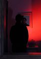
Color in the Foyerby underbyteComment: The shadow that's of the person on the wall really takes your focus away from the mirror. Maybe it could be a little lighter too...it's hard to see the person. But I like the idea! Keep trying! |
 Photographer found comment helpful. Photographer found comment helpful. |
| 09/03/2004 12:02:35 AM |
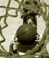
breaktimeby petrakkaComment: I would like to see a little more of the face. Great idea; awesome! |
| Photographer found comment helpful. |
| 09/03/2004 12:00:54 AM |
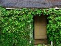
Country Portalby BradComment: The shadow at the top of the door really takes away from the picture. If you could find some way to brighten that up without doing anything to the rest of the photo, this would be perfect. |
| Photographer found comment helpful. |
| 09/02/2004 11:59:35 PM |
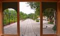
Triptychby pablotolaComment: I would've maybe put some type of focal point in between the parallel lines. Right now, my eye goes all around the picture, and not to the "vanishing" sidewalk as I think that you were meaning it to be. Otherwise, great capture. |
| Photographer found comment helpful. |
| 09/02/2004 11:55:42 PM |
The Shop Windowby BudComment: Unfortunately, the torch made a lens glare. I'm not sure how you would get rid of it!! Great capture tho for this challenge. |
| Photographer found comment helpful. |
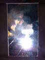
| 09/02/2004 11:50:14 PM |
Behind the Red Gateby aerogurlComment: Photo looks really washed out. Less lighting would've made this an excellent picture! I like the style, and the framing idea! |
| Photographer found comment helpful. |
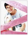
| 08/30/2004 10:58:53 AM |
Future Hopeby Keith-Comment: Nice clarity, but I think that it is too close--maybe a little of the neck would even it out a little bit. i like the lighting, too-soft, and it compliments the photo. |
| Photographer found comment helpful. |
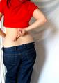
| 08/30/2004 10:55:51 AM |
Hope for a smaller backside ?by yukiComment: Good idea, but the shadow that the girl is giving off, draws the eye away from the subject. Maybe get another light source and shine it the other way to minimize or take away that shadow? |
| Photographer found comment helpful. |
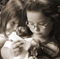
| 08/30/2004 10:49:47 AM |
Hope - For a Kitten Without a Momby SandyPComment: How do you get the "bronze" b&w effect?? I've tried looking on my camera, but to no luck! Is it something that can be changed on photoshop?? Nicely placed subjects, great lighting! |
| Photographer found comment helpful. |
Home -
Challenges -
Community -
League -
Photos -
Cameras -
Lenses -
Learn -
Help -
Terms of Use -
Privacy -
Top ^
DPChallenge, and website content and design, Copyright © 2001-2026 Challenging Technologies, LLC.
All digital photo copyrights belong to the photographers and may not be used without permission.
Current Server Time: 06/27/2026 04:30:29 PM EDT.