| Image |
Comment |
| 07/22/2014 07:16:46 AM |
Far From the Sea by hesitantComment: Would like to see the boat a tad bit brighter to make me focus on it and not the sun. |
 Photographer found comment helpful. Photographer found comment helpful. |
| 07/22/2014 07:15:55 AM |
|
| Photographer found comment helpful. |
| 07/22/2014 07:14:42 AM |
Long Abandoned by franktheyankComment: I hate that I like how painterly this is. Very 3-dimensional - almost portal like. Very nice. |
| Photographer found comment helpful. |
| 07/22/2014 07:12:01 AM |
You can almost hear footstepsby luddeComment: I'm trying to figure out if I'd prefer just a bit less shadow at the right edge or not. My eye is saying "Yes", but I get that it's supposed to disappear to nothingness. Either way, I like it a lot. 8 |
| Photographer found comment helpful. |
| 07/22/2014 07:10:03 AM |
Pby banmornComment: I don't know if it's just the way this site does verticals, but I'm thinking a crop down from the top to 4:5 might have been better. 6 |
| Photographer found comment helpful. |
| 07/22/2014 07:08:40 AM |
|
| Photographer found comment helpful. |
| 07/22/2014 07:07:32 AM |
|
| Photographer found comment helpful. |
| 07/22/2014 07:06:51 AM |
All is lost.by KMcCComment: Vignette feels too tight - side feels like it should be a little brighter and I'm getting a huge hot spot in the middle that is distracting as heck. Properly trated this could have been a lot higher than 5. |
| Photographer found comment helpful. |
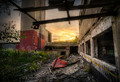
| 07/22/2014 07:03:33 AM |
Contemporary Ruinsby illini75Comment: Just the right amount of clarity and structure. Thanks for not going over the top. It could stand a little touch up to remove the haloing around some of the edges. 7 that could have been higher. |
| 07/22/2014 07:01:36 AM |
|
| Photographer found comment helpful. |
Home -
Challenges -
Community -
League -
Photos -
Cameras -
Lenses -
Learn -
Help -
Terms of Use -
Privacy -
Top ^
DPChallenge, and website content and design, Copyright © 2001-2025 Challenging Technologies, LLC.
All digital photo copyrights belong to the photographers and may not be used without permission.
Current Server Time: 09/02/2025 01:39:56 AM EDT.