|
|
|
Showing 1921 - 1930 of ~2328 |
| Image |
Comment |
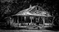
| 08/28/2014 10:41:19 AM | sure realismby TiberiusComment: I would have liked to see the ground floor instantiated as a part of this instead of running it off the bottom. |  Photographer found comment helpful. Photographer found comment helpful. |
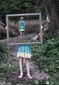
| 08/28/2014 10:39:48 AM | always too soonby tateComment: Familiar scene, but still cool. Given the caption, it might have been better with a wardrobe change. | | Photographer found comment helpful. |
| 08/28/2014 10:38:28 AM | | | Photographer found comment helpful. |
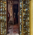
| 08/28/2014 10:37:34 AM | Totemby eaxthelmComment: I'm staring hard but I can't seem to recon what's in the glass. |
| 08/28/2014 09:06:16 AM | All is lost.by KMcCComment: Critique Club:
Well, this is interesting since I've drawn this to critique and already left a comment during the voting, so I'll expound on that.
Composition is OK. I find it interesting that you compressed the crop top-to-bottom. I mentioned the vignetting feels tight and perhaps more room above and/or below would have eased that. Original lighting looks to have been rather harsh, and your high contrast treatment doesn't necessarily help with that.
There's a lot of debris across the roof and on the porch, but there's also a lot along the side of the house hidden in the shadows. Softening the contrast might have helped you show a bit of that as well. As I mentioned, there's also an overtly bright spot on the roof (bare alluminium?) that draws the eye immediately - but there's nothing there. All this goes to say that there's no real subject here for the eye to be drawn to. I suspect you mean it to be the house, and if so, show the whole thing. Pull the shadows out on the side, burn in the roof a bit and get some evenness to the light. Then burn in the area in front of the house and the highlights in the trees and make the whole thing pop.
All that said, there's still a lot going on with the place and to show it in a way that makes you feel it and see it will take some work, particularly in a B&W conversion. Greyscale can make a lot of elements of different colors blend together, so you need to be careful with this and use a tool that allows you to adjust the sensitivity of your various colors in the greyscale image to get the definition you need.
Spending the time with this image you could have, as I said before, earned a lot better than the 5 I gave you initially, and the 6 that you averaged.
| | Photographer found comment helpful. |
| 08/27/2014 06:12:45 AM | Purple Produceby JakeKurdsjukComment: Originally posted by Kroburg:
Another great veggie shot Jake, congrats on the HM |
Thanks, Kees. Apparently I've found my muse. LOL And the same to you. I'm glad the purple in some of the top 5 was real and not just added in post. ;) Message edited by author 2014-08-27 06:13:23. |
| 08/26/2014 03:31:56 PM | Eyes of a Childby Ja-9Comment: Critique Club Comment...
First off, I like this image a lot. I suspect it didn't do better in a Free Study because folks tend to like something that pops more. There's also something about verticals that seem not to perform that well. In a portrait or B&W specific challenge I think this would have done better.
Compositionally there's not a lot of fault I can find here. I like that you went with a 5x7 crop instead of the 2:3 straight out of camera ratio. If I am bothered by anything it's the eyes, which is your subject based on the title. First off, they do not lie on any line of any of the classic compositional techniques, like the rule of thirds. Interestingly enough, had you gone with a 4:5 (8x10) crop ratio the eyes would have landed square on the top third line if you cropped off the bottom. It also effectively increases the relative size of the eyes within the borders of the photo.
The B&W conversion has retained some sparkle, but it's lost all definition in the irises. Plus the photo-left iris is darker than the photo-right. On my calibrated monitor it's nearly impossible to see the left pupil. The reflections are also very distracting against the dark irises. There's likely not much you can do about the reflection, but most conversion tools will allow you to play with color filters or color intensity and you should have been able to lighten them a bit so we could see the details. Otherwise they seem sharp and in focus.
Possible other improvements? The background could be found to be slightly distracting. Perhaps burning in the lighter triangle section of wall so that it blends in better with the darker parts would further bring the focus onto the eyes.
Again, it's a really nice photo that just needs a little more finishing. As one of the commenters points out, I think the cropping is what did you in on this one. Try the 8x10 crop and see what you think. | | Photographer found comment helpful. |
| 08/25/2014 10:13:54 AM | Vintage Font 160by JakeKurdsjukComment: Originally posted by Ja-9:
This is another one that I thought would do well in the voting...DUMB Voters!!!! |
Thanks. I do believe there are 2 types of voters here. 1) The Knee-jerk type that hit the NEXT arrow and if they're not immediately impressed by vivid colors, extreme contrast, Windows Wallpaper scenary or a field of abstract blur they simply hit 4 or 5 and then NEXT again. 2) The thoughtful, "if I don't get it right away I'm willing to give it a chance and maybe even come back again" type.
Type one can likely care less what the category is and just wants to see impressive photography, and doesn't mind seeing a favorite take nearly identical photos of themselves challenge after challenge with only costume and lighting changing, or flower after flower after blasted flower. They could care less if something isn't really purple for a Purple challenge, as long as someone took the perfect night sky photo and MADE it purple. The photography has to have no merit other than a recognizable familiarity that they like. There are apparently a LOT of this type of voter on this forum, and it nearly drove me off, because I won't/can't play their likes and still enjoy what I'm shooting (and I can barely make it through voting on a challenge with any level of integrity because I KNOW who shot what, because it's almost just like what they shot last time, and the time before).
Thankfully, I've learned to just shoot for myself, and to appreciate with the OTHER type of voter chimes in. So thanks again for doing so,  Ja-9 Ja-9, regardless of whether or not you like the shot. |
| 08/25/2014 08:25:44 AM | sliced togetherby mitalapoComment: Wonderful street image that not only fits the category but easily stands well on its own. | | Photographer found comment helpful. |
| 08/25/2014 08:22:36 AM | Vintage Font 160by JakeKurdsjukComment: Thanks to those of you who recognized something different here. I have to say I was more than a little angry when this was sitting at 5.4-something after 2 days and 20 votes, so I appreciate those of you who got me over the 6.0 hump. Maybe if I'd flipped it so those who don't recognize what this is could at least read it? ;)
Next time I'll try and include a waterfall or lakeside sunset. |
|
Showing 1921 - 1930 of ~2328 |
Home -
Challenges -
Community -
League -
Photos -
Cameras -
Lenses -
Learn -
Help -
Terms of Use -
Privacy -
Top ^
DPChallenge, and website content and design, Copyright © 2001-2025 Challenging Technologies, LLC.
All digital photo copyrights belong to the photographers and may not be used without permission.
Current Server Time: 09/02/2025 04:24:34 PM EDT.
|