| Image |
Comment |
| 06/03/2004 04:49:43 PM |
Waiting for Playersby NeuferlandComment: Really cool idea. Lots of drama here. Interesting composition - really like the dark smudges on the wall even. Good luck 10 |
 Photographer found comment helpful. Photographer found comment helpful. |
| 06/03/2004 04:49:11 PM |
Basketball Goalby stewadeComment: Oh man... I love this one. It's my favorite in this entire challenge. 10 I hope this wins!!! |
| 06/03/2004 04:48:54 PM |
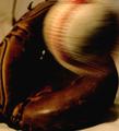
The Catchby SondaComment: I think this would have been really good if the lighting was a bit better, the grain/noise/jpeg compression wasn't so high (even in low lighting, try to use a low ISO - digital cameras tend to create too much noise with high ISOs). Also, it always adds something if one thing is in motion (or has motion blur) to have the rest of the image dead sharp adn in complete focus. I'm not sure if it's the grain or the saturation bleeding, but the mit doesn't look sharp and in focus. |
| Photographer found comment helpful. |
| 06/03/2004 04:47:36 PM |
Dive Teamby eric678Comment: Absolutely love this one. It's interesting, has breat contrast and composition. Good luck 10 |
| 06/03/2004 04:47:21 PM |
Anticipationby ZoomdakComment: A very good idea for this challenge. Because there is so much going on in the background, it may have been a better composition if you put something into the forefront to draw the reader's eye into the rest o the scene. Maybe something to explain teh event, like a track outfit, a programme, etc. not sure. I can't tell what people are waiting to see, but that's okay too. Just needs something int he forefront - maybe even to create some drama with DOF. Good luck with this though. it's a good idea. |
| Photographer found comment helpful. |
| 06/03/2004 04:46:04 PM |
|
| Photographer found comment helpful. |
| 06/03/2004 04:45:50 PM |
Ole Ole Oleby trainComment: Love that you put something in the forefront to draw the eye into the image. Really excellent idea for this particular composition. The composition works really well but the saturation seems a bit dull. I can tell it was probably a very colourful scene. Maybe you can do something in your software program to increase the saturation or hues slightly. -7 |
| Photographer found comment helpful. |
| 06/03/2004 04:42:24 PM |
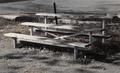
No Game Todayby OneSweetSinComment: This is a good composition, but the colours are so muted and not very saturated that it appears kind of dull. I realize you're probably trying to create a mood with this one - with teh dead grass, etc., but it's not as compelling because of that. |
| 06/03/2004 04:41:39 PM |
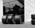
Unsung Heroes of the Black Artby Go-KLComment: Really cool idea. I like that there's something in the forefront that draws the viewer's eyes into what teh guys inthe shop are doing. I even like the tires on the left side. Good luck 8 |
| Photographer found comment helpful. |
| 06/03/2004 04:41:13 PM |
Field Lightsby AarthekComment: Very intersting idea. Maybe it could have been even better if you shot it looking straight up at the light - almost to make it look like a diagonal. An effective idea for this challenge though. |
| Photographer found comment helpful. |
Home -
Challenges -
Community -
League -
Photos -
Cameras -
Lenses -
Learn -
Help -
Terms of Use -
Privacy -
Top ^
DPChallenge, and website content and design, Copyright © 2001-2025 Challenging Technologies, LLC.
All digital photo copyrights belong to the photographers and may not be used without permission.
Current Server Time: 07/24/2025 10:53:44 PM EDT.