| Image |
Comment |
| 12/05/2007 05:30:19 PM |
Tarmacby jaysonmcComment: Cool composition. I like the plane all the way in the extreme corner. There is some distortion in the grid and I wonder if it would work to fix that. Because the distortion is only at the top (I am guessing you cropped some on the bottom) I think it is a little off-putting. A very cool shot. 7 from me. |
 Photographer found comment helpful. Photographer found comment helpful. |
| 12/05/2007 05:26:49 PM |
Bay Bridge -- Western Spanby GeneralEComment: I like the line of the fence along the bottom of the frame (in addition the the great line of the bridge, of course). Nice exposure. You have alot of detail in the clouds and in the mountains in the distance. |
| Photographer found comment helpful. |
| 11/02/2007 08:13:34 PM |
Breaking pointby nico_blueComment: I like the dramatic backlighting and the orangish, warm tones. I think this shot would work better if it was super sharp (I know that is a bit of a DPC cliche, but I think it would work here). It would bring out the fibers of the rope and empasize the tension. The soft focus doesn't seem to suit the image. 6 from me. |
| Photographer found comment helpful. |
| 09/15/2007 12:45:46 PM |
Family Portraitby printer4uComment: This is very nice. Nice job with outdoor lighting. The light is soft and directional and you have nice cathclights in the eyes. Very well done. My little critiques would be a) the tree growing out of the smallest girls head (a quick step to the left would have prevented this). b) the older girls arm bent backwards like that is awkward looking. The older your models/subjects get the more you have to pay attention to their posing. c) the older girls feet out in front are a little distorted and look awkwardly big. I would have had her curl her legs back to the side or pose her a little differently so her legs wound up behind the littlies. That would get her white shorts (a tiny bit blown) minimized and just leave the nice pinks and blue in there. These little nitpicks are minor in comparison to the overall nice job you did with color, sharpness and lighting. A very nice group portrait. |
| Photographer found comment helpful. |
| 09/04/2007 08:07:17 PM |
Dark Realmsby AtlantisComment: Very nicely done. I love the fiery catchilghts in the eyes coming through the shadows. |
| Photographer found comment helpful. |
| 09/02/2007 03:16:37 PM |
solitudeby arsenalComment: I like the sliver of the scene on the right with the cows at the extreme bottom. |
| Photographer found comment helpful. |
| 08/21/2007 10:58:16 PM |
Dreamerby Wenders11Comment: This is phenomonal. I love the silohuette of the plan and the profile of the boy. I love hte composition (including the tilt). Two small things I would tweak. I wish the sky either had a little more color in it or was a true black and white. Here is just seems almost brown. Also, I wish that the other foot of the boy was showing, at least a little bit. Still such a cool shot that I gave it a 9. |
| Photographer found comment helpful. |
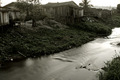
| 08/19/2007 10:01:39 PM |
Shanty Townby BudComment: Somehow your composition seems unbalanced to me. Maybe that was your intent. If the shanties are the subject, I think they need a little more room above them in the frame. I like the line of the shanties mirrored by the muddy river, but your camera position/angle just doesn't seem to fit quite right in the frame. I like the textures in this shot. The ripples in the water, the grass, the wood planks on the buildings all work very well in black and white. 6 from me. |
| Photographer found comment helpful. |
| 08/03/2007 07:47:43 PM |
Waterdropsby DiScComment: I like the OOF petals at the very bottom of the foreground. It makes this shot a little quirky and different from the way we typically see it. Nice job with the colors. 7 from me. |
| Photographer found comment helpful. |
| 08/03/2007 07:44:08 PM |
"A whiter shade of pale"by fredahenryComment: Very nicely lit and I like your post processing. I like the unconventional composition and the lines of her arms. I am not sure that the big hand in the foreground works for me, but I am not sure how yo uwould avoid it and keep the pose/composition. Maybe if her hand was more relaxed so at least her thumb wasn't sticking up there it would help. 7 from me. |
| Photographer found comment helpful. |
Home -
Challenges -
Community -
League -
Photos -
Cameras -
Lenses -
Learn -
Help -
Terms of Use -
Privacy -
Top ^
DPChallenge, and website content and design, Copyright © 2001-2025 Challenging Technologies, LLC.
All digital photo copyrights belong to the photographers and may not be used without permission.
Current Server Time: 08/04/2025 02:22:25 PM EDT.