| Image |
Comment |
| 03/06/2006 09:10:10 PM |
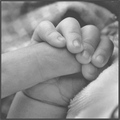
A hand that will lead his futureby DiComment: Very sweet! IMO, it could use lots more contrast. It is very middle gray throughout and lacks a good tonal range. I would use levels to bring the shadows down and the highlights up. |
 Photographer found comment helpful. Photographer found comment helpful. |
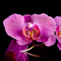
| 03/06/2006 09:05:05 PM |
orchidby wnowak1Comment: Very pretty, and great clarity and colors. The composition could be stronger. Maybe by tilting a little and moving the main flower towards the upper corner. It feels like the main flower is too centered and the surrounding flowers are chopped off. |
| 03/06/2006 12:33:51 PM |
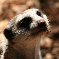
Dreamerby 308Comment: The harsh light really hurts the image, IMO. The fact that the eye closest to the camera is completely in shadow makes it hard to appeciate his cute little face. With a wildlife shot like this, I don't want to say "use a reflector" or "turn his head into the light" because that seems like silly advice. Maybe shooting when the sun is lower in the sky or in more open shade is the best strategy.
I like your tones in this image, and your focus is right on. His whiskers are nice and sharp and the bokeh in the background is very pleasant. |
| Photographer found comment helpful. |
| 03/06/2006 09:40:32 AM |
Air Brakesby o2bskatingComment: Very cool angle. A great flight shot. The composition is really nice with the square, too. I wish more of the bird was in focus. |
| Photographer found comment helpful. |
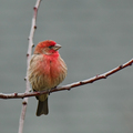
| 03/06/2006 09:34:28 AM |
Profile Squaredby jbsmithanaComment: Very nice. The branches make great leading lines. Your focus is perfect on this little finch. He even has a catchlight in his eye. |
| Photographer found comment helpful. |
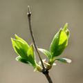
| 03/06/2006 09:32:08 AM |
Ready for springby philupComment: My favorite of the "bud" images. I like the backlighting very much, it makes the shot. The highlights might be a little hot in the brightest spots, but I don't think it detracts from the image. Maybe tilting it a little more and putting the leaves closer to the lower right corner could make the composition a little more dramatic. |
| Photographer found comment helpful. |
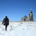
| 03/06/2006 09:12:14 AM |
Maybe Look To The Spires Of Goldby ColeyComment: Cool concept. I think a different angle and perspective could have worked better, especailly with the square crop. I wonder if you could have gotten a lower angle and in a little tighter, so the subject would be lower in the frame and the church would be higher. Nice exposure for the blue sky and the black angel and the snow. |
| Photographer found comment helpful. |
| 03/06/2006 08:50:20 AM |
littleby bucketComment: Precious! THe lighting is great the way it highlights her face. I would have burned down her sleeve, so that it does not draw attention away from her face. |
| Photographer found comment helpful. |
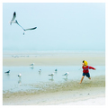
| 03/06/2006 08:48:00 AM |
Chasing Fun by CutterComment: Wonderful composition! Works great in the square. I love the boys pose. I like how the how image is mostly the same tones, expect the boy who stands out in bold colors. Very fun shot. It made me smile. |
| Photographer found comment helpful. |
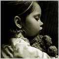
| 03/06/2006 08:41:20 AM |
Mysteriousby tryals15Comment: The small bit of the white of her right eye poking through her hair is disctracting to me. I find my eye drawn to it rather than her beautiful other eye that is visible. I like the idea of having only one eye showing. Perfect focus and clarity, especially in the eye. I would have cropped a little more off the top and left a little more space under her chin. |
| Photographer found comment helpful. |
Home -
Challenges -
Community -
League -
Photos -
Cameras -
Lenses -
Learn -
Help -
Terms of Use -
Privacy -
Top ^
DPChallenge, and website content and design, Copyright © 2001-2025 Challenging Technologies, LLC.
All digital photo copyrights belong to the photographers and may not be used without permission.
Current Server Time: 08/05/2025 02:16:56 AM EDT.