| Image |
Comment |
| 09/02/2006 09:36:25 PM |
Esmeby muckpondComment: Very cute. Nice softness to the colors and lighting. I wish her hands were not chopped off. |
 Photographer found comment helpful. Photographer found comment helpful. |
| 09/02/2006 01:55:13 PM |
pureby hannekeComment: A wonderful angle for a sleeping newborn. So many photographers get a sort of 'up-the-nose' angle on babies lying down. Great DOF and wonderful shrpness in the face. I love the fist curled up by the face. So sweet. This seems cool and a tad underexposed, though. |
| Photographer found comment helpful. |
| 09/02/2006 01:52:33 PM |
Always a Princess...by lentilComment: I like the high key look here, but the lack of catchlights in her dark eyes (except for the pin-light flash) really hurts the image. Try putting her nearer to a window and watch for light in the eyes before you shoot. I like that you got down on her level for this shot. You captured a great little girl expression. You have a lovely little model. |
| Photographer found comment helpful. |
| 09/02/2006 01:48:37 PM |
On the Edgeby kr1staComment: I think this would look cool with even more space to the right and below the caterpillar. Nice sharpness and colors. |
| Photographer found comment helpful. |
| 09/02/2006 01:47:02 PM |
[ R E F L E C T ]by ericwooComment: The lighting is great here. Very moody and dramatic. I would have toned down the brightness of the helpmet just a bit. I realize it is a major element in the image, but it really competes with his face. His expression is what really tells the story. |
| Photographer found comment helpful. |
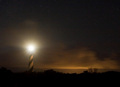
| 09/01/2006 08:22:13 PM |
Night Liteby Resusit8uComment: Stunning! Like a painting. The lighthouse light is sublime and I love the sillohuetted trees on the horizon. The clouds conspired with you. I like the oblique line that the clouds make leading the eye to the lighthouse. |
| Photographer found comment helpful. |
| 09/01/2006 05:00:14 PM |
Curiosityby shadowdoc31Comment: Great backlighting! My first instinct was to suggest a less centered composition, but the more I look at it, the more I like him dead center. It is kind of quirky, which suits the image to me. |
| 09/01/2006 04:58:55 PM |
these are the daysby mimsydotesComment: I like the treatment you did with the muted colors here. It suits the image very well. I love the light falling on her upturned face (and it helps that her chest is shadowed so you don't emphasize the neckline) I wish her feet weren't cropped out, though. |
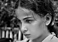
| 08/28/2006 05:26:11 PM |
introspectionby ErinMComment: I love the intensity of the expression that you captured here. Although it kind of breaks a rule, I like the flyaway hair cutting through her eye. It sheilds her a little from the viewer and makes the moment seem more private. This is very nice and sharp and I like your b/w conversion. Compositionally, I would like more room beneath her chin and maybe a little more room to the left. It would make her eyes less centered and give her some space to 'look into'.
Your daughter is beautiful. Very nice shot!
Liza |
| Photographer found comment helpful. |
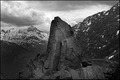
| 08/25/2006 10:31:16 AM |
Mordorby adamwebComment: I like the centered composition and the dramatic conversion. It looks oversharpened to me. I can see a halo between the dark rocks and the sky. |
| Photographer found comment helpful. |
Home -
Challenges -
Community -
League -
Photos -
Cameras -
Lenses -
Learn -
Help -
Terms of Use -
Privacy -
Top ^
DPChallenge, and website content and design, Copyright © 2001-2025 Challenging Technologies, LLC.
All digital photo copyrights belong to the photographers and may not be used without permission.
Current Server Time: 08/04/2025 01:44:30 PM EDT.


![[ R E F L E C T ]](https://images.dpchallenge.com/images_challenge/0-999/536/120/Copyrighted_Image_Reuse_Prohibited_387738.jpg)