| Image |
Comment |
| 07/22/2004 09:31:48 AM |
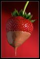
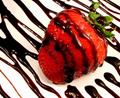
Double Dipped by smokeditorComment: nice photo but I would have used a slightly darker chocolate. I find this adds a great affect to the red strawberry. nice background, great color clarity and sharpness. also a nice touch with the dripping chocolate. <8> |
| 07/22/2004 09:27:04 AM |
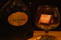
Glass of Chocolateby pfellnerComment: This is a very dark photo. I like the lighting and its nice to see a photo that looks like art then advertising revisited. This photo is something I would expect to see in a high class bar or liquor shop. a very elegant photo. well done. <8> |
 Photographer found comment helpful. Photographer found comment helpful. |
| 07/22/2004 09:20:51 AM |
|
| Photographer found comment helpful. |
| 07/22/2004 09:17:12 AM |
and lead us not into temptation...by PhileineComment: a photo that you would expect to see in a chcoclate shop is always nice to see. beats the others pics in this challenge that look more like advertising revisited. nice composition and clarity. <7> |
| Photographer found comment helpful. |
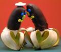
| 07/22/2004 08:52:46 AM |
Romanceby siggiComment: lol a funny. great shot. I like the way it looks like art instead of advertising revisited challenge. <7> |
| Photographer found comment helpful. |
| 07/22/2004 08:49:54 AM |
Sensualy Sweetby portComment: In my opinion this is not a very appealing shot. The chocolate does not look dark enough to pull this shot off. Glad to see hat it looks more like art the advertising tho. nice lighting and clarity and composition, just not fussy on the color of the chocolate. it looks to me more like body paint or something along thoise lines. <7> |
| 07/22/2004 08:42:24 AM |
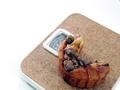
BIG BARby Rando D300Comment: nice shot but to me it does not capture the spirit of this challenge. Looks more like it was shot because it was close to you house or you just happened to be passing by and saw it. I like the angle you captured it on and nice clarity but its just not my cup of tea so to speak. <6> |
| Photographer found comment helpful. |
| 07/22/2004 08:39:14 AM |
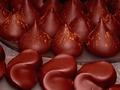
Chocolate Sauceby redmondson01Comment: Great shot. excellent color, clarity, composition and positioning. Looks more like "photographic art" instead of advertising and a shot I would expect to see on display. well done. <9> |
| Photographer found comment helpful. |
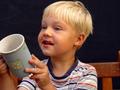
| 07/22/2004 08:33:20 AM |
More hot chocolate pleaseby aKiwiComment: I would have cropped out the right side of the picture not exposing the chair at all or very little of it. Centering the composition takes a lot more away then it gives I find. Using the rule of thirds would have made this a better shot in my opinion. Nice colors and clarity. <7> |
| Photographer found comment helpful. |
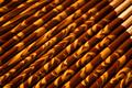
| 07/22/2004 08:29:35 AM |
Tiger Stripesby JesuispeureComment: As it looks more like art then advertising like some of the other pictures I've viewed to me it does not portray chocolate. it actually looks more like insense. However nice clarity and DOF. |
| Photographer found comment helpful. |
Home -
Challenges -
Community -
League -
Photos -
Cameras -
Lenses -
Learn -
Help -
Terms of Use -
Privacy -
Top ^
DPChallenge, and website content and design, Copyright © 2001-2025 Challenging Technologies, LLC.
All digital photo copyrights belong to the photographers and may not be used without permission.
Current Server Time: 08/08/2025 09:04:35 PM EDT.