| Image |
Comment |
| 02/02/2005 07:50:27 AM |
|
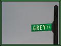
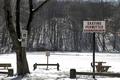
| 02/02/2005 07:49:12 AM |
Going Nowhereby oracleComment: Great signs but its not the clearest shot I've seen. I find there's a lot of noise in the shot but it is level which I find a lot of photos in this challenge aren't. Good luck in this challenge. |
 Photographer found comment helpful. Photographer found comment helpful. |
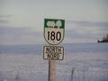
| 02/02/2005 07:47:40 AM |
Rural Routeby IslanderComment: A fillflash would have gone a long way on this shot. I also woul have prefered to see the sign level instead of having the appearence of leaning. Good luck in this challenge. |
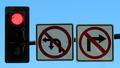
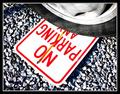
| 02/02/2005 07:45:04 AM |
Speed Trap :(by Jeff OComment: Good shot but I find it lacks crispness. It looks like the contrast is a little to bright which is giving a blurry look to the whole picture. It may also be the white balance. I like the crop and positioning of the shot. Good luck in this challenge. |
| Photographer found comment helpful. |
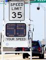
| 02/02/2005 07:42:47 AM |
Wheelchairs on Iceby atsxusComment: Its not very clear altho it is one of the funnier shots I have seen in this challenge. I find that the signs are a little to small to see well and the contrast is over powering. It also looks that the photo may be a little over sharpened. Good luck in this challenge. |
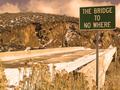
| 02/02/2005 07:39:26 AM |
Walking on the Skyby ferojedaComment: Not sure I understand this photo but thats probably because its an unfamiliar sign. Excellent colors and clarity but I also find it lacks interest. Good luck in this challenge. |
| Photographer found comment helpful. |
| 02/02/2005 07:37:09 AM |
"nowhere"by real_ndnComment: Nice sign but whats up with the color??? It almost seems like a sepia tone but isn't. I also find the clarity to be a little OoF. Good luck in this challenge. |
| 02/02/2005 07:35:01 AM |
|
| Photographer found comment helpful. |
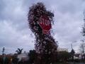
| 02/02/2005 07:33:47 AM |
Stop and Smell the Rosesby rubytuesdaiComment: The title goes well with the shot but I find it lacks clarity. Might I suggest turning your camera sideways/vertical to get a taller shot and less width. I think you would have found a more appealing shot and would have gotten rid of the distracting buildings on either sign of the stop sign. Good luck in this challenge. |
| Photographer found comment helpful. |
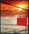
| 02/02/2005 07:31:41 AM |
Beware of the Dogby cheekymunkyComment: I'm not fond of this shot. I find the sun s way to distracting and it blinds out the words on the sign. I also find the shadows ofthe bars on the back of the sign to be very distracting. A nice touch with the dog but it honestly looks like the dog is lose on the beach and the cage is meant for people to keep out/off the beach. Perhaps if the sign way backed by a piece of paper or cardboard to make it less transparent it would have made a difference. Good luck in this challenge. |
| Photographer found comment helpful. |
Home -
Challenges -
Community -
League -
Photos -
Cameras -
Lenses -
Learn -
Help -
Terms of Use -
Privacy -
Top ^
DPChallenge, and website content and design, Copyright © 2001-2025 Challenging Technologies, LLC.
All digital photo copyrights belong to the photographers and may not be used without permission.
Current Server Time: 08/11/2025 03:08:57 PM EDT.