| Image |
Comment |
| 02/04/2005 11:16:02 AM |
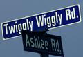
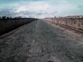
twiggly wiggly rd.by lightningComment: Altho its a nice photo with excellent color and clarity it does nothing for me. It is a funny name for a street and a great capture there's something about it I'm just not fond of. I believe its the lack of interest or subject. A very hard challenge to say the least but you have done well with your entry. Good luck in this challenge. |
| 02/03/2005 09:55:31 AM |
|
| 02/03/2005 09:53:03 AM |
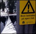
Tread On Your Own Riskby MonaComment: great capture. Excellent colors, clarity and outstanding sharpness. well done and good luck in this challenge. <7> |
 Photographer found comment helpful. Photographer found comment helpful. |
| 02/03/2005 09:43:01 AM |
"Atlantic or Pacific"--- Which Will it Be ??by SamTComment: Great highway shot and its outside the "norm". A beautiful shot despit the quality of the camera. I like this shot because it allows the viewer to get lost in the photo(imagination). Well done and good luck in this challenge. <7> |
| 02/03/2005 09:28:16 AM |
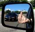
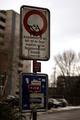
The road signby LevTComment: hahahaha too funny. I give this a 10 cuz I use this sign all the time and find there is a lck of humour in this challenge. It also has great color, clarity and excellent focus. well done and good luck in this challenge. |
| Photographer found comment helpful. |
| 02/03/2005 09:26:04 AM |
Where Are The Signs?by Lone_WolfComment: I'm just not fond of this shot. I find there is too much noise/distortion not to mention that without the title in my opinion this would not meet the challenge. Good luck in this challenge. |
| Photographer found comment helpful. |
| 02/03/2005 09:24:33 AM |
He Stands Aloneby Mr_PantsComment: The silohouette against that dark sky really adds to this shot. I find it goes well with the high grain/noise. well done and good luck in this challenge. <8>
on second consideration I uped score to and 8 from 7 |
| Photographer found comment helpful. |
| 02/03/2005 09:21:01 AM |
Bible signby undieyatchComment: Not that I'm fond of religious photo's the brightness of the background makes it appear to have to high of contrast and be a little to bright. I also find it not to have very good clarity or focus. Perhaps if it weren't so close or upward looking would have been a better shot. Good luck in this challenge. |
| 02/03/2005 09:17:45 AM |
|
| Photographer found comment helpful. |
| 02/03/2005 09:13:13 AM |
Requestby ClickNSeeComment: Beautfil DoF and excellent crispness on the sign. It goes well with the lights in the background. Perhaps taking an inch off the right side to make it more centered (if you will) would have made for a better picture and reduced he amount of grey that you see. I think it would have drawn the eye more into the photo as well. Good job and good luck in this challenge. <7> |
Home -
Challenges -
Community -
League -
Photos -
Cameras -
Lenses -
Learn -
Help -
Terms of Use -
Privacy -
Top ^
DPChallenge, and website content and design, Copyright © 2001-2025 Challenging Technologies, LLC.
All digital photo copyrights belong to the photographers and may not be used without permission.
Current Server Time: 08/11/2025 12:42:14 PM EDT.