| Image |
Comment |
| 04/13/2005 08:19:44 AM |
River Ratby TearionComment: Way to small. Had it been bigger I'm sure it would have done nicely in this challenge. |
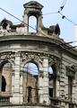
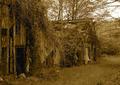
| 04/13/2005 08:17:00 AM |
Broken Dreamsby AlbireoComment: Very interesting building but the trees block most of it and in my opinion are very distracting. |
 Photographer found comment helpful. Photographer found comment helpful. |
| 04/13/2005 08:16:04 AM |
It once was a church, but now...by Bob FossComment: In my opinion this doesn't fit the challenge. You have managed to caputer a beautiful shot of a broken window but not of the building. Perhaps if it was so much of a close up shot and you could see more of the building in it would have made for a better shot. Good luck in this challenge. |
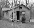
| 04/13/2005 08:14:23 AM |
Forgotten Barracksby gbautista87Comment: I think this photo would have looked a LOT better if both your dimemsions were not 640. As it is I find it very hard to look at because of the odd size. |
| Photographer found comment helpful. |
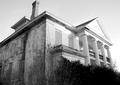
| 04/13/2005 08:12:09 AM |
Faded beautyby ThorrComment: I fear the camera may have focused a little more on the lines in front of the building then the building itself. It appears the building is slightly blurry but a great shot none the less. Good luck in this challenge. |
| Photographer found comment helpful. |
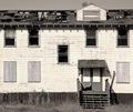
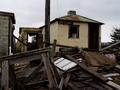
| 04/13/2005 08:08:43 AM |
Funeral Home of the Past (Passed)by Resusit8uComment: The contrast of the photo makes the whites look blown out. I find that it has also made the clarity a little OoF. Still a beautiful building tho. Well done and good luck in this challenge. |
| Photographer found comment helpful. |
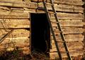
| 04/13/2005 08:00:41 AM |
Early Log Cabinby joe_minerComment: Great shot but the brightness of the sun puts a certain hue onto the building which in my opinion is not very appealing. Perhaps a B&W conversion and tone down the contrast would have made for a nicer picture. I really like the way the ladder flows thru the photo as it draws my ey into the photo. Well done and good luck in this challenge. |
| 04/13/2005 07:58:37 AM |
Shadows of the pastby ThelmaComment: The contrast of the sky make the top half of this photo look a little blurry or OoF. The photo also appears to be off level by about 1 or 2 degrees ccw. |
| 04/13/2005 07:56:52 AM |
Greenhousesby joebokComment: wow excellent shots. could have been a touch brighter tho. Being that the image is so dark it loses a little bit of clarity and depth. I also think that you may get some low scores due to the composition of the shot and that it is small. I would love to see the original after the challenge is over tho if possible. <7> |
| Photographer found comment helpful. |
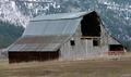
| 04/13/2005 07:49:22 AM |
Rustic Barnby JacksonComment: Nice shot but the photo doesn't look level. Perhaps a 1 or 2 degree rotation cw would have made for a better picture. |
| Photographer found comment helpful. |
Home -
Challenges -
Community -
League -
Photos -
Cameras -
Lenses -
Learn -
Help -
Terms of Use -
Privacy -
Top ^
DPChallenge, and website content and design, Copyright © 2001-2025 Challenging Technologies, LLC.
All digital photo copyrights belong to the photographers and may not be used without permission.
Current Server Time: 08/11/2025 08:36:48 AM EDT.