| Image |
Comment |
| 05/24/2004 03:29:18 PM |
Heavy loadby cabaComment: usually not a fan of the "wooden" subject but this is extremely well done. you've done a fab job with the lighting and composition. one of my favorites this challenge |
 Photographer found comment helpful. Photographer found comment helpful. |
| 05/24/2004 03:28:13 PM |
|
| Photographer found comment helpful. |
| 05/24/2004 03:27:40 PM |
|
| Photographer found comment helpful. |
| 05/24/2004 03:27:27 PM |
|
| Photographer found comment helpful. |
| 05/24/2004 03:26:29 PM |
|
| Photographer found comment helpful. |
| 05/24/2004 03:26:01 PM |
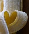
Something to Eat between Classesby tyt2000Comment: really like your use of blue to set off the yellow subject. interesting composition (would like a bit more room above the subject's head) One of my ribbon picks. |
| Photographer found comment helpful. |
| 05/22/2004 09:23:00 AM |
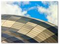
sage12.jpgby osramComment: In this view of the building, the sky colors are more compatible with the building so I like the sky better -- the placement of the clouds are interesting as well.
I like the building in your entry better as this one is a bit dark (did you lighten it in photoshop using levels on only the building? It may be hard because you also have bright white spots on the top edge) Also, I'd like to see more of the building as it is very unique and colorful. |
| 05/20/2004 09:49:22 PM |
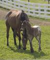
Mother's Loveby shkelly587Comment: Hi Sharon,
Greetings from the Critique Club...
Congrat on your best score to date!
You've emphasised the "new" here in your fine shot. Reading the comments I have to agree that in terms of composition, you've told a great story with the position of your two subjects. You have the basis of a shot that would benefit from a bit of post-processing.
I would agree with many of your commenters about boosting the contrast to remove the hazy aspects. I would add that the fence, while it adds a "touch of the farm" is too bright and competes for my attention. Dulling or blurring this element even more than it already is would force my eye to stay on your sweet scene.
I look forward to more of your lovely countryside as seen by your photographic eye.
If you have any questions, feel free to pm me.
Regards,
Theresa |
| Photographer found comment helpful. |
| 05/20/2004 09:41:44 PM |
Shapely Sageby osramComment: Paul,
Greetings from the Critique Club (and welcome to competition -- your first photo for Something New II)
I like your composition - the placement of the main subject (building) at an angle gives the shot an abstract quality (that several other comments seemed to like as well). I agree that the sky seems to detract. I think that it's a fine sky but doesn't "go" with the muted tones and geometric shapes so my eye fights back and forth from building to sky. A flatter sky (adjusted in post processing) may have provided a more neutral backdrop.
The lines that cross at the diagonals are distracting as they distrupt the curves and patterns you created in the rest of the shot. These curves and patterns are well done and the way the light changes the colors on them give the shot extra interest.
We all look forward to more of your work.
Please pm me if you have any questions on my comments
Regards,
Theresa
|
| Photographer found comment helpful. |
| 05/20/2004 06:32:50 PM |
|
Home -
Challenges -
Community -
League -
Photos -
Cameras -
Lenses -
Learn -
Help -
Terms of Use -
Privacy -
Top ^
DPChallenge, and website content and design, Copyright © 2001-2025 Challenging Technologies, LLC.
All digital photo copyrights belong to the photographers and may not be used without permission.
Current Server Time: 08/25/2025 03:24:14 AM EDT.