| Image |
Comment |
| 07/04/2004 10:21:55 AM |
|
 Photographer found comment helpful. Photographer found comment helpful. |
| 07/04/2004 10:19:45 AM |
Hostageby BeagleboyComment: Powerful image, excellent use of light and shadow to tell your story. One of my ribbon picks. |
| Photographer found comment helpful. |
| 07/04/2004 10:18:17 AM |
Captain George Highlighted.by graphicfunkComment: One of my top picks this theme. Excellent expression on your model (you've capture warmth and a devilish sense of humor) I would have liked a bit less right elbow. Really like the gray/blue color palete. |
| Photographer found comment helpful. |
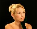
| 07/04/2004 10:15:29 AM |
My Love...by toddheadComment: One of my top picks this theme.. excellent lighting. What would have made it a ribbon pick? The negative space on either side could have been removed and thus moving your subject out of dead center. Also there's something hard/stiff about her mouth that don't match the excellent gaze of her eyes. The pulled up hair distracts me a bit (could be the dof or the loose strands) Lastley the hand fades too much into the background just around the chin. (please don't get the feeling I don't like it -- I do!) |
| Photographer found comment helpful. |
| 07/04/2004 10:11:51 AM |
Annaby heidaComment: Great composition/placement of your model - eye level and direct look into the lens engaged me immediately. you've worked wonders with the light/shadow making this a unique and well done portrait. One of my ribbon picks |
| Photographer found comment helpful. |
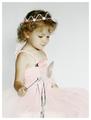
| 07/04/2004 10:10:36 AM |
Princess by SonifoComment: Just wonderful.. subject is placed well in the frame, pink highlights give it a hand-colored feel, high key provides a softness that matches the subject. One of my ribbon picks. |
| Photographer found comment helpful. |
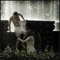
| 07/02/2004 07:55:35 AM |
The crazy summer days (candid at the midtown fountain).by frumoazniculComment: a really great shot (I'd leave off the "editoriall" candid comment in your title). The composition is made by the subject jumping into the water. B&W treatment works well. Blurry stuff in the lower foreground distracts a bit but adds to the chaotic water feel. |
| Photographer found comment helpful. |
| 07/02/2004 07:53:18 AM |
New Hope Bridgeby graphicfunkComment: I drive across this one almost every day -- always thought about where I shoot it from... :)
I think you've got about the best angle. I think it's missing a focal point (as composed the abutment (?) becomes the focal pont but it's too far away to be very interesting and too bland in color to add much to the shot. |
| Photographer found comment helpful. |
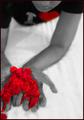
| 07/02/2004 07:42:59 AM |
I Love Petalsby RoosterComment: Hi Rooster
Greetings from the Critique Club...
I rated this image fairly high in the challenge. There's a lot to like. For the sake of balance I'll look for "what might make it better" but the image stands strong as is.
I agree with another of your commenters that the composition is the strength here. Many aspects serve to strengthen - the contrasty b&w, the red petals spilling out of the frame balanced by the subject's face spilling out at the top. The odd glowing red of the petals, arms, and hands contrasts nicely with the "standard" look of the torso and chin. I never met a diagonal I didn't like (to quote a fellow-dpcer)
For the red-heart... I see that it helps pull my eye thru the composition (the face would do that on its own) and ties into the meaning of the petals. Would the shot be better without it colored? I don't think so. Is it much better with it? No. The "I" is more distracting because it clicks me into reading instead of feeling.
On the tight cropping - I think it works in all but one area. The right arm could be a bit more in the frame. I really like the tension caused by the cropping at the bottom and top.
I hope this was helpful. Please pm me with any questions or comments.
Regards,
Theresa |
| Photographer found comment helpful. |
| 07/01/2004 09:00:23 PM |
|
| Photographer found comment helpful. |
Home -
Challenges -
Community -
League -
Photos -
Cameras -
Lenses -
Learn -
Help -
Terms of Use -
Privacy -
Top ^
DPChallenge, and website content and design, Copyright © 2001-2025 Challenging Technologies, LLC.
All digital photo copyrights belong to the photographers and may not be used without permission.
Current Server Time: 08/25/2025 11:22:47 PM EDT.