| Image |
Comment |
| 12/18/2012 04:48:23 PM |
Aug 12-25by bassboneComment: Which challenge? Fractals?
It's a good image, but I would have killed it in that challenge.
|
 Photographer found comment helpful. Photographer found comment helpful. |
| 12/18/2012 10:00:36 AM |
Morphby MaryOComment: I was really trying to figure out what his was without reading your description. Once you know what you're looking at it seems so obvious.
Your patience paid off before it's definitely a unique photo. |
| Photographer found comment helpful. |
| 12/18/2012 06:16:34 AM |
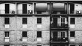
Urban Jungleby mrchhasComment: So simple, but effective.
That one column breaks up the monotonicity of the image making for a good capture. |
| Photographer found comment helpful. |
| 12/18/2012 02:46:10 AM |
#18: 8-12-2012by Art RoflmaoComment: Lensbaby or post?
Either way it's a really cool photo. Love the selective focus on the action and the water drops and really sharp adding to the effect. |
| Photographer found comment helpful. |
| 12/18/2012 02:43:26 AM |
|
| Photographer found comment helpful. |
| 12/17/2012 08:48:02 PM |
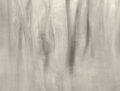
Can't see the Wood for the Trees.by jomariComment: Time to pick up an old filter myself. I was thinking of doing that after the soft focus challenge, but never got around to it. It's a really cool effect that can't be recreated in post.
Do you apply the vaseline so it's evenly distributed? How? |
| Photographer found comment helpful. |
| 12/17/2012 08:46:14 PM |
07246by pixelpigComment: Originally posted by pixelpig:
If I was shooting it now, I would've gone for motion blur rather than lack of focus blur. |
And that would be the right move. The colours would create a really cool image depending on the blur. This is your forte, so I'm sure you could pull it off. |
| Photographer found comment helpful. |
| 12/17/2012 08:44:30 PM |
17. Sunflower (Aug 04)by hajekaComment: Good composition. I love how the purple works with both the yellow and green. It's a pleasing image. |
| Photographer found comment helpful. |
| 12/17/2012 08:36:21 AM |
Day 17by MinsoPhotoComment: The lighting seems off.
It doesn't accentuate his physique at all, and like Karen pointed out, looks a little forced.
I did this, but it took 30 attempts to get the lighting semi-correct.

The inspiration for my take came from this photo by nsjabs.

You could always throw a fill light in the front and I think it would look really good. I can tell that you have lights on both sides of the subject and because of the amount of light, no definition comes through. |
| Photographer found comment helpful. |
| 12/16/2012 08:55:34 PM |
lost in thoughtby mrchhasComment: Originally posted by bassbone:
The pose and composition are fantastic, the noise...well not so much. |
I guess I'll steal his comment as I was thinking the same thing. |
| Photographer found comment helpful. |
Home -
Challenges -
Community -
League -
Photos -
Cameras -
Lenses -
Learn -
Help -
Terms of Use -
Privacy -
Top ^
DPChallenge, and website content and design, Copyright © 2001-2025 Challenging Technologies, LLC.
All digital photo copyrights belong to the photographers and may not be used without permission.
Current Server Time: 08/05/2025 06:30:35 AM EDT.