|
|
| Image |
Comment |
| 12/10/2003 05:36:06 AM | |  Photographer found comment helpful. Photographer found comment helpful. |
| 11/28/2003 09:58:17 PM | ain't the brightest crayon in the boxby ScantyNebulaComment: Greetings from the Critique Club
composition
Nice Job. I suggest moving the subject further from the middle of the photo, and possibly using it to cover up the white blob in the background (slightly to the right in the top center) because it is kind of distracting. Also try to fill the frame or use a darker background to eliminate the white in the upper left corner.
color
Nice job with this...all of the crayons in sight ar very bright colors which helps bring your point across.
contrast
The contrast here would have been wonderful if the tip of the black crayon was not in the midst of the shadows. Again try using the tip to cover up the white blob in the background.
focus
Well done.
depth of field
This is my favorite aspect of the shot.
lighting
Try lighting this from a lower angle and see what happens, although I do like the reflection of the lighting on the crayons.
any other element of the photo that stands out or is lacking in some way
Overall I think that this was one of the best shots in the challenge. Please take these comments into consideration, re-shoot this idea, and let us see the results. ~Rob | | Photographer found comment helpful. |
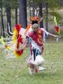
| 11/28/2003 09:36:20 PM | Dances to the beat of a different drummer.by newtune3Comment: Greetings from the Critique Club
composition
Overall I think this is a nice composition. If I could change anything I would get a bit closer, and try to fill up the frame with those beautiful feathers.
color
Wonderful job here. The colors turned out very bright and bold.
contrast
Again, if you were just a bit closer to the subject I think that it would help... I especially like the way the colors contrast where they meet his head, the feathers on the wand that is in his left hand, and where the white ribbon overlaps his teal pants.
focus
This apect of the shot is great. I love how the feathers are blurred, and the face/body is frozen. I wish the trees were not in such sharp focus though.
depth of field
Would have been nice to see a bit shallower depth of field so that the trees were not in focus, and more attention would have been drawn to the subject.
lighting
Nice job.
any other element of the photo that stands out or is lacking in some way
Overall this photo is wonderful. It kept me entertained for a long time, and really captured the motion of his dance quite well. Thank you for sharing it with us, I hope this helps. ~Rob |
| 11/24/2003 05:12:55 PM | Pennilessby OneSweetSinComment: Greetings from the Critique Club
composition
I really enjoy the shapes formed by the negative space between the coins, although I think that this could be brought out a lot by having a solid colored background. The crease between the hands that runs off of the top/center of the image is sort of distracting, but easily fixed by trying different angles.
color
If this image were converted to black and white the blue and skin colored reflections would look more like silver, and the green on the dime would not be a problem. This would also help bring out the negative shapes that I mentioned previously.
contrast
I would have liked to see more midtones, see lighting.
focus
Macro is tricky. If you don't hold your camera at the exact right distance often times it is easy to focus on a subject that was meant to be secondary such as the hands in this instance. Try taking the same shot with the camera about an inch further from the subject to capture the coins in sharp focus, and take some of the emphasis off of the hands.
depth of field
Again try to increase the amount of coins in sharp focus. I reccomend setting them on a solid background, and using a longer exposure time.
lighting
I would try taking a light gray card and trying to capture the reflection of it to change the color of the coins faces to be lighter and add more midtones. Also try bouncing your flash off of a ceiling so that the glare doesn't bounce back into the lens creating those distracting white spots on the coins.
any other element of the photo that stands out or is lacking in some way
I think that this was a wonderful idea for the challenge, and with a little bit of development could have easily been one of the best. Hope this helps. ~Rob | | Photographer found comment helpful. |
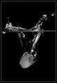
| 11/24/2003 05:39:33 AM | ''Ice Fall'' by Shannon O'Cork by kiwinessComment: Greetings from the Critique Club
Let me begin by saying wow. This image is a wonderful work of art. I absolutely love the way that it reads, the lighting is perfect, the contrast is wonderful, I agree that the bubble should be removed but other than that I would not change a thing. You have a real talent, and I am glad to be priveledged enough to get the inside scoop on how you created this image. (end brownnosing here)
~Rob | | Photographer found comment helpful. |
| 11/23/2003 06:04:06 PM | The Fall of Freddy the Leafby GREENMEMComment: Greetings From The Critique Club...
-composition-
The composition of this photo is good, but I would have liked to have seen a closer shot with more attention paid to the details of the leaf than the background, especially the spots on the leaf, and the jagged edges which provide a unique opportunity to create shapes with the negative space (look at the shadow on the tip of the leaf)
-color-
These colors say rainy day to me, overall I think they work well, but I would like to see more saturation in the color of the leaf.
-contrast-
The contrast of the sharp yellow edges with the dark gray is good, I believe that the leaf could stand out a bit more if you were to focus on the details a bit more. Things to try: Get a little closer, experiment with different angles, experiment with use of different lighting.
-focus-
The focus works well for the angle that this was shot at.
-depth of field-
The photo comes off as flat.
-lighting-
Again, the lighting makes this photo scream rainy day to me.
-any other element of the photo that stands out or is lacking in some way-
If you have the chance I reccomend that you go and take a shot of the same subject matter from a different angle, and a bit closer/tighter...this may involve getting down flat on your stomach, or placing the camera at a lower angle. Really try to focus more on the details of the leaf more than the texture of the background. Overall I think you are on the right track, but when I am shooting a photo I try to portray my subject from at least 3 different points of view. |
| 11/19/2003 03:29:11 AM | |
| 11/19/2003 03:20:51 AM | | | Photographer found comment helpful. |
| 11/19/2003 03:18:37 AM | America, 2003by muckpondComment: Where can I get some America Print Duct Tape? You should make bumper stickers out of this photo. |
| 11/19/2003 03:17:07 AM | | | Photographer found comment helpful. |
Home -
Challenges -
Community -
League -
Photos -
Cameras -
Lenses -
Learn -
Help -
Terms of Use -
Privacy -
Top ^
DPChallenge, and website content and design, Copyright © 2001-2025 Challenging Technologies, LLC.
All digital photo copyrights belong to the photographers and may not be used without permission.
Current Server Time: 08/23/2025 01:50:23 AM EDT.
|