| Image |
Comment |
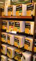
| 03/27/2004 01:40:56 AM |
Orange Is For Dummiesby RtwoComment: I really would have prefered a tighter horizontal crop, maybe just "The Internet" through "Office 200_" to remove the two signs on top. The color seems off though, since I own some dummies books, I can vouch for their being yellow and not orange, so that doesn't sell me on this picture at all. Score: 4 |
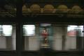
| 03/27/2004 01:38:28 AM |
The Subwayby JametvComment: Cool! Nice action shot. I would have prefered a tighter crop on the top to remove the ceiling of the station to focus the viewer on the train and the man. Is that jacket really orange though? It looks read to me with a yellow hat. ^_^ Score: 5 |
 Photographer found comment helpful. Photographer found comment helpful. |
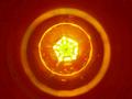
| 03/27/2004 01:36:44 AM |
Bottle eclipseby FirebombhellComment: An interesting take and I find it to be a neat try. However, if you are going to place your subject in the middle, crop the surrounding area evenly (take some more off the top or leave more on the bottom). All the black spots and stripes are really distracting. Score: 3 |
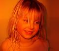
| 03/27/2004 01:33:22 AM |
orange lightby middelboschComment: Cute shot, it would have been great for the Portrait challenge. I really don't like the orange light though, you did a wonderful job of lighting your subject, but it doesn't complement her at all. The wall pattern is too busy, or is that noise?
Either way, it is distracting. Score: 4 |
| 03/27/2004 01:26:43 AM |
Lick itby kanolandComment: Wow, what an awesome bonfire! The purple is really cool, but the blown out white sections all over are WOAH, really bright! The solid black bacground and lack of noise are great, but the whole thing looks pixelated. I like you cropping, but perhaps less black on the bottom? Score: 4 |
| Photographer found comment helpful. |
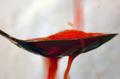
| 03/27/2004 01:23:33 AM |
Just a splash of orangeby Hax0rComment: Really cool idea. Unfortunately I don't really care for the look. Everything is blurred, except for the metal spoon, but I'd like to see more of the liquid than just the bottom of the spoon. I do like the action. Could you have gotten the background to be a more even white and perhaps brighter? Score: 4 |
| Photographer found comment helpful. |
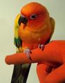
| 03/26/2004 10:32:11 PM |
A Bird In The Handby hallswelComment: Pretty bird and good idea. Maybe try upping the contrast to make the background white and to bring out the colors of the bird. The focus on the hand is good, but the bird's head is blurry, and I'd rather have a clear focus on the bird than the glove. I like the way you cropped it and didn't center the bird vertically. Score: 4 |
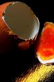
| 03/26/2004 10:28:15 PM |
Yoked to Deathby simbambaComment: Ew...The shell is orange, but that's not the main subject here. The bright red and yellow of the yoke draw the eye. The yellow streak is really distracting from the great plain black background. Maybe try using a horizontal crop. Score: 4 |
| Photographer found comment helpful. |
| 03/26/2004 09:32:35 PM |
You say tomato, I say tomorange-oby omnibusComment: Good plain background, a bit of an offset, and nice colors. No orange. The noise realy detracts from this, it would have definately been bumped up at least 1 more without that and then another if there were something orange in it (other than a tiny part where the stem was). I like the idea of removing the stem to make it a 'tomorange.' Score: 3 |
| 03/26/2004 09:30:52 PM |
Life Saverby shardyComment: Cute idea with the hat! Too pixelated though, try not to crop that close or if that is because of your camera, size it down a bit. I like angling it, but what about a more extreme one? The black rail on the top bothers me because it isn't level with the edge, so either a more extreme angle or cropping it off would suit me more. ^_^ Score: 4 |
Home -
Challenges -
Community -
League -
Photos -
Cameras -
Lenses -
Learn -
Help -
Terms of Use -
Privacy -
Top ^
DPChallenge, and website content and design, Copyright © 2001-2025 Challenging Technologies, LLC.
All digital photo copyrights belong to the photographers and may not be used without permission.
Current Server Time: 08/02/2025 07:44:47 AM EDT.