|
|
| Image |
Comment |
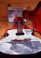
| 06/23/2004 06:17:11 PM | The News is Bluesby joek1dComment: This goes in order of what I notice first:
1) Would this appear in a newspaper? - I don't think so, it's of a paper instead.
2) Composition - The background does nothing for it. Also, the sides of the guitar should be included, not chopped off like that.
3) Lighting - It's too uneven. The back paper is in the shadows and the floor reflects it.
Score: 4 |
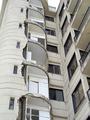
| 06/23/2004 06:16:56 PM | Shakes With No Quakesby soheilComment: This goes in order of what I notice first:
1) The title is confusing, but it's not affecting the score for this photo because I understand it enough.
2) The lighting is kind of blah, the sky is overexposed and bright, but the building (especially next to this gray website background) is uninteresting.
3) The repetition is nice for a different challenge, but for a newspaper it would have been cropped to only one or two rooms to get the point across, because that's all that is needed.
4) On the otherhand I like the overall composition, perhaps a more central position between the two to make the angles more even, it just feels kind of off...
Score: 5 |  Photographer found comment helpful. Photographer found comment helpful. |
| 06/23/2004 02:18:42 PM | Help yourself but choose wisely.by melismaticaComment: What the heck, I understood your photo... -_- I don't get it, what happened in this challenge? This is a great photo that should have done much better! It especially didn't deserve 10 1s and 14 2s.
Your use of negative space/clouds & sky really draws your eye to the sign (not to mention with the red of the sign as you said). And there is nothing BAD about it at all! | | Photographer found comment helpful. |
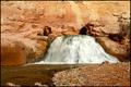
| 04/05/2004 10:36:58 PM | Fremont Fallsby pitsamanComment: Originally posted by pitsaman:
Well,when you see a Snapshot of a pet gets more points than a classic waterfall/rocks texture with river leading lines and water at rules of third placed bellow the hill, you get an idea who is voting here ! |
Sour grapes indeed. It really does need to be cropped closer to the falls if you want a better score. Talk about looking like a snapshot. | | Photographer found comment helpful. |
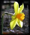
| 03/31/2004 08:58:20 PM | A heart of ..... Orange?by TrinchComment: I didn't get to commenting on all of my 4 scores as I'd hoped, but here goes.
The border takes away from the brightness of the flower. Great DOF, but the angle just seems a little...blah. Perhaps from more infront or below, but the above doesn't give us the full effect. There is more yellow than orange, and the orange is not the main subject of the photo. Really beautiful clarity, but the colors, angle, and border hurt it. | | Photographer found comment helpful. |
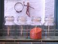
| 03/30/2004 10:56:03 PM | Orangeby JacquesComment: Too washed out. The black edging of the tile draws your eye more than the orange and the figure in the back doesn't seem to serve any purpose. The reflection doesn't bother me and I like the offset of both the container and the figure in the back, however could you make the distance between the containers even? Perhaps even not influde the sides of the window as a frame, unless you are going to on the top as well, the picture is contained, but then released all up there. Score: 4 |
| 03/30/2004 10:53:02 PM | A Fraction of The Messby dgregsladeComment: Yellow cords with perhaps a hint of orange... It'd be a great shot for 'Chaos.' ^_^ Great clarity and DOF, but the reflection is distracting. Also, could you have not gotten the red cord underneath? For the cropping, maybe more on the left side to get rid of the partial port and then more on the right to get the whole port. Score: 4 |
| 03/30/2004 10:50:04 PM | sps - shaded plastic spiralby carodaniComment: Eh, it looks really yellow/brown. I like the subject, it's a new idea, however, it's placed right in the center and really does not make the photo interesting there. I do like your cropping though, keeping everything even. Perhaps it is the light, but it seems soft to me and when it looks like that is paper, I'd like to see crisp edges. Score: 4 | | Photographer found comment helpful. |
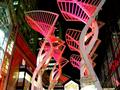
| 03/30/2004 10:47:53 PM | Orange turning to pinkby ShakeyComment: I really like the structure and the idea, but there are waaaaay too many distracting elements. The bright lights in the building on the left and on the bottom are bad. The ones behind it you might be able to get away with if you cropped of those. It also seems like the orange/pink structure isn't as in focus as the buildings on either side, I'm not sure if that is because of the lighting or what though. Also, try not to cut off the top of the one on the right. If you made this a horizontal picture it would probably fix most of these problems. Score: 4 | | Photographer found comment helpful. |
| 03/27/2004 01:45:07 AM | Pansyby karenikaComment: Wow, I love pansies. Unfortunately I see very little orange, so I had to mark it down, even though this is wonderful. The DOF seems off because of the huge black patch, it makes it feel like on ly the back leaf is in focus (which it may very well be). It is really annoying to look at a picture and have the majority of it blurry. Score: 4 |
Home -
Challenges -
Community -
League -
Photos -
Cameras -
Lenses -
Learn -
Help -
Terms of Use -
Privacy -
Top ^
DPChallenge, and website content and design, Copyright © 2001-2025 Challenging Technologies, LLC.
All digital photo copyrights belong to the photographers and may not be used without permission.
Current Server Time: 08/02/2025 07:39:00 AM EDT.
|