| Image |
Comment |
| 03/18/2004 11:41:12 PM |
Room Heaterby kaushComment: Too dark, boring. Try to get more light, although it is dark, the lighting is even, which is good. |
 Photographer found comment helpful. Photographer found comment helpful. |
| 03/18/2004 11:39:22 PM |
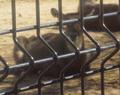
Bueaty Cagedby littlegettComment: Too blurry, too noisy. Choose what to focus on, the bars or the animal, but not both. Don't crop it too much so that you get too blurry. |
| Photographer found comment helpful. |
| 03/18/2004 11:17:40 PM |
color pencilsby alysaComment: I love the perspective and the panoramic feel. It would have been better without the yellow pencil and those on that side. |
| Photographer found comment helpful. |
| 03/18/2004 11:13:00 PM |
Amandaby amandamillerComment: I love the photo and the lighting, but I don't see any parallels. |
| 03/18/2004 10:30:48 PM |
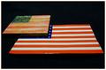
Purple Heartby katlynComment: A little more cropping needed on the top and right to cut off the last bit of white. Also, move the heard down to center it so that there are two stars on each side of it. I'm not sure how, but try not to have the red overpower the rest of the photo. |
| Photographer found comment helpful. |
| 03/18/2004 10:21:01 PM |
same ole schtickby xburnerxComment: Would have prefered the front of it to be in focus as well and not to have the shine on the front. |
| 03/18/2004 10:12:30 PM |
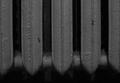
DP CHALLEnGEby thumperComment: Well, interesting idea, but no go for me. To make it better: use a non-reflective/shiny/velvety background- a solid black is best, make the lines straight- use a ruler or something to straighten them, do not over expose the match sticks- they are waaay too bright (the wood part) and overpower the image. |
| Photographer found comment helpful. |
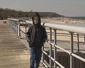
| 03/18/2004 10:09:32 PM |
BOARDWALKby TLL061Comment: Nice parallels, but the way he is standing and where he is standing make it look like a candid shot for the family photo album. Try having him closer to the camera or farther away from the camera, use the rule of thirds. Try using a larger size as well, use the 640 limit to your advantage. I don't know how or why, but it looks fuzzy, maybe you cropped it too close or something, but try to avoid this. Having the title in all capitals makes it seem like you are yelling, at least to me, and I don't like to be yelled at. ^_^ |
| Photographer found comment helpful. |
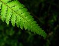
| 03/18/2004 09:53:01 PM |
natural orderby lakritstrollComment: Great color, lighting, and DOF. I don't see parallels. This would be great for a repetition challenge. |
| Photographer found comment helpful. |
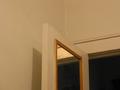
| 03/18/2004 09:49:24 PM |
casual voidby la magaComment: Hm, I see more angles than parallels, and the parallels are only if I try and find them. A tighter crop to the door and frame would help, as would a boost of contrast to make the white walls white. To prevent the yellowish coloring try and use the white balance controls on your camera, the indoor setting should overcome the yellowing effect. |
Home -
Challenges -
Community -
League -
Photos -
Cameras -
Lenses -
Learn -
Help -
Terms of Use -
Privacy -
Top ^
DPChallenge, and website content and design, Copyright © 2001-2025 Challenging Technologies, LLC.
All digital photo copyrights belong to the photographers and may not be used without permission.
Current Server Time: 08/02/2025 08:40:35 PM EDT.