| Image |
Comment |
| 03/17/2004 08:02:21 AM |
|
 Photographer found comment helpful. Photographer found comment helpful. |
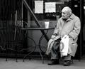
| 03/16/2004 10:48:24 PM |
What was that !!by mattComment: sorry...colors are dull, there is red-eye, and the top of the hair being chopped off is distracting. |
| 03/16/2004 10:46:12 PM |
|
| 03/16/2004 10:39:43 PM |
|
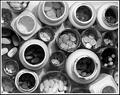
| 03/06/2004 10:45:24 PM |
Day-to-day HIV/AIDS Pharmacopoeiaby flip89Comment: **Critique Club**
Hi Ken -
Positives:
Good take on the challenge. I also like the angle of your shot and the way you filled the frame.
Possible Improvements:
I really think the B&W takes away from the impact of this shot. Your lighting is also a bit harsh. There are a few white spots that are blown out and the shadows in the bottles are distractive. I think a diffuser of some sort, and lighting from a higher angle would have helped.
I hope you found this critique useful. I look forward to seeing your future entries.
Regards,
Chris
|
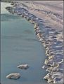
| 02/29/2004 09:51:50 PM |
Icy Cosmosby flip89Comment: **Critique Club**
Hi Ken!
Positives:
Meets the challenge well. I like the line of the shore running up right to left. The natural lighting is good.
Possible Improvements:
There is no real contrasting colors here, so the photo looks rather dull. Maybe bumping up the levels and saturation just a tad would help. Seems to have a bit of noise and might be over-sharpened just a bit, as well.
Hope you find this critique helpful. Look forward to seeing your future entries.
Regards,
Chris |
| 02/25/2004 11:44:24 PM |
|
| 02/25/2004 11:40:16 PM |
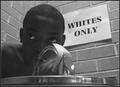
50 years ago... defiance bred a Leader by RoosterComment: This is absolutely great. I hope people take the time to understand this message. I was going to do something with the same message, but couldn't get subjects for it.
Composition is done very well. |
| Photographer found comment helpful. |
| 02/24/2004 09:06:26 PM |
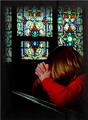
Prayerby jpochardComment: **Critique Club**
Hi Judy -
The composition and lighting on your subject is good. Interesting take on the challenge.
Possible Improvements:
There seems to be a bit of noise, as the subject is not in sharp focus. It looks like your focus may have actually been on the window. I think it may have looked better with a shallower DOF with the window blurred more. The brightness of the window is just a little distracting.
Good luck with your future entries.
-Chris |
| Photographer found comment helpful. |
| 02/24/2004 08:09:24 AM |
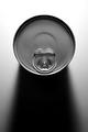
canby fannybComment: Nice sharp focus. I like the shadow too. I would have given it a 7, at least.
I noticed in your comments, you liked this better, but didnt post because you thought people would think it was too PSed. First, I don't think it looks too PSed at all. Secondly, screw the voters, do what you like. :-) |
| Photographer found comment helpful. |
Home -
Challenges -
Community -
League -
Photos -
Cameras -
Lenses -
Learn -
Help -
Terms of Use -
Privacy -
Top ^
DPChallenge, and website content and design, Copyright © 2001-2025 Challenging Technologies, LLC.
All digital photo copyrights belong to the photographers and may not be used without permission.
Current Server Time: 08/27/2025 07:23:41 PM EDT.