| Image |
Comment |
| 06/06/2002 09:28:00 PM |
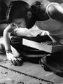
Focusby zaynoComment: This is a really great shot, with good feeling to it. The background is slightly distracting below her face, but that's okay. |
| 06/03/2002 11:56:00 PM |
...by ReubenComment: I hadn't even thought about Kilroy. :) |
| 06/03/2002 03:29:00 PM |
...by ReubenComment: Re: Wanting to see more of the face That was part of my goal. I wanted the viewers to wonder "what's he thinking about, and who is he?". Re: Cropped, or just that good at framing Just that good. (It's just math, you know). Re: Not cropping the glasses Well, it wasn't cropping. If you mean you wanted more of the glasses on the right, well, I could have done that, but it wasn't in the picture to begin with and it didn't distract me enough to fix it. If you meant you wanted to see the bottoms of the glasses, then you would also have had to be looking up my nostrils. |
| 06/08/2002 05:13:00 PM |
Small Wonderby welcherComment: This was one of my 10s. I absolutely loved the competition for my eye between the OOF face and the in-focus and. |
| 05/27/2002 12:19:00 AM |
Focusby lecalanComment: I think I'd have preferred the horizontal composition, leaving some room for the horse and rider to "jump into". |
| 05/26/2002 11:21:00 PM |
|
| 05/14/2002 12:13:00 PM |
Heaven help you ifyou do 10 in a 60 zone!by sulamkComment: Nice idea, but it doesn't feel like you put much effort into the execution. I'd bet it's just a snapshot from the car, in which case I'd have to give you kudos for the composition. |
 Photographer found comment helpful. Photographer found comment helpful. |
| 05/14/2002 12:07:00 PM |
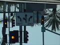
Which way did you say?by mtngoatComment: Excellent idea, and I love the choice of the yellow light. Every time I look, I expect "ONLY" to be upside down, before I remember that both the sign and the photo are upside down. This is a really interesting photo to look at. |
| 05/27/2002 12:51:00 AM |
Mirror Imageby janfriesComment: I think the twig would have been good, except that it complemented the dip in the line of trees a bit too well. |
| Photographer found comment helpful. |
| 05/19/2002 06:26:00 PM |
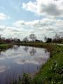
Reflectionsby RemieComment: I think this was one of the better composed reflection shots. The contrast between the brightness int he sky and the dark ground is interesting, but the ground is a bit too dark for my taste. It feels like there are three distinct worlds here: The sky, the ground, and the reflection. Nice job. |
Home -
Challenges -
Community -
League -
Photos -
Cameras -
Lenses -
Learn -
Help -
Terms of Use -
Privacy -
Top ^
DPChallenge, and website content and design, Copyright © 2001-2025 Challenging Technologies, LLC.
All digital photo copyrights belong to the photographers and may not be used without permission.
Current Server Time: 08/20/2025 09:37:02 PM EDT.