| Image |
Comment |
| 12/29/2003 10:10:03 PM |
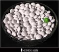
Individualityby rickhd13Comment: very nice - but for perfection's sake, it would be nice if you fixed the scuff (or whatever that is on the m&m two to the left of the green one) |
 Photographer found comment helpful. Photographer found comment helpful. |
| 12/29/2003 09:56:45 PM |
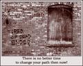
Tired of Dead Ends?by TooCoolComment: nice photo, but i think a different border color and font type would strengthen this poster a bit |
| Photographer found comment helpful. |
| 12/26/2003 12:28:15 AM |
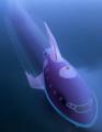
20,000 Leaguesby CountComment: i ran your image through neatimage (www.neatimage.com) and it came out MUCH better.. not sure if you've heard of it, but it's done wonders for me. |
| 12/25/2003 07:29:22 PM |
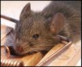
Chappedby YomiComment: nice, but i think a larger DOF would improve upon it slightly. |
| 12/25/2003 03:25:12 AM |
Set the limit!by kinksComment: woah. definitely a different sort of animal entry. just makes me wonder how you took it (doesn't look dead to me.. looks a bit like a model). either way, a nice capture. unfortunately, i imagine you might receive some low scores from animal lovers solely based on the subject. |
| Photographer found comment helpful. |
| 12/25/2003 03:19:53 AM |
off the deep endby MiahComment: i like the interpretation and execution.. very good facial expression and composition. i also think the graininess works well here. perfect black in the mouth is also a nice touch. |
| Photographer found comment helpful. |
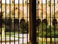
| 12/25/2003 03:17:28 AM |
inner lifeby Pep VentosaComment: nice. i like the steel/strong boundaries between the elegant gardens + architecture and the viewer. seems slightly blown out in the upper left portion. |
| Photographer found comment helpful. |
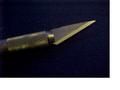
| 12/25/2003 03:14:59 AM |
Edgemakerby billiebComment: the photo seems a bit out of focus (especially for such a "sharp" subject) and is either rusty or could use some white balance.. either way, the yellow tint isn't too attractive to me. interesting border.. i understand what you're trying to convey and i think it adds to the image for me.. but also think that some won't understand and you might lose some points for that. |
| Photographer found comment helpful. |
| 12/24/2003 05:21:15 PM |
On the edge in force 8by doginroomComment: interesting.. i'm curious to see where this was taken - it almost looka as if the ocean abruptly ends at that wall. i would've liked to see a little mor e of the focus on the ship than the foreground. |
| Photographer found comment helpful. |
| 12/24/2003 12:35:26 AM |
On the Edgeby lightpro1Comment: i like the concept, but the picture is a bit yellow.. might want to color balance in camera or during post-editing. stick also seems a bit out of place, but it doesn't seem like there's much you could've done about that. |
| Photographer found comment helpful. |
Home -
Challenges -
Community -
League -
Photos -
Cameras -
Lenses -
Learn -
Help -
Terms of Use -
Privacy -
Top ^
DPChallenge, and website content and design, Copyright © 2001-2025 Challenging Technologies, LLC.
All digital photo copyrights belong to the photographers and may not be used without permission.
Current Server Time: 08/01/2025 01:47:19 AM EDT.