| Image |
Comment |
| 09/21/2005 03:06:45 AM |
Staircase Descending to Fish Pond by Keith ManiacComment: Wow! Okay, first of all - WOW at the photograph. Amazing shot - great contrast, great tones, great lines, and.. dare I say it? - Great perspective.
Second of all - wow at all those duplicate comments! |
 Photographer found comment helpful. Photographer found comment helpful. |
| 09/19/2005 02:53:40 PM |
|
| Photographer found comment helpful. |
| 09/15/2005 05:46:33 PM |
IMG_6246.jpgby ajschelComment: I think the heavy shadows here and lack of interesting color (to me, at least) leaves this as a good candidate for conversion to Black and White. |
| Photographer found comment helpful. |
| 09/15/2005 01:10:02 AM |
Humpty Dumptyby moviemanComment: Thought I'm not certain, this photo looks somewhat backlit, creating a good contrast between the web and the background (though this might not have fit everyone's definition of HC).
Unfortunately, the harsh lighting also seems to blow out some detail on the spider. That, combined with the fact that the focus doesn't look quite spot on (or it the lens just soft?) probably contributed to the lowish score that you received. The composition and interest are there, but the lighting wasn't particularly in your favor. Still a good effort, and better luck next time :)
- Critique Club |
| Photographer found comment helpful. |
| 09/15/2005 12:22:31 AM |
Memories of Ralphby SeanachaiComment: Wonderful idea and story to accompany it. A very thoughtful and well-executed tribute to Ralph. |
| Photographer found comment helpful. |
| 09/14/2005 03:42:43 AM |
|
| Photographer found comment helpful. |
| 09/12/2005 02:56:28 AM |
Obstaclesby riotspyneComment: Very nice, off-beat portrait.. the gritty texture in the beard/mustache make the chain links work, imo. |
| Photographer found comment helpful. |
| 09/12/2005 02:45:32 AM |
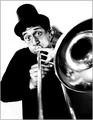
Strike Up the Band!by TranquilComment: Wonderful shot - the high contrast certainly fits the subject well. I'll just jump right into it. I think the blur in the trombone itself is a non-issue, because if the trombone is being played.. there's bound to be some motion, right? Plus, the lack of focus and leading lines help draw the attention to the player.
The cheeks and eyes are great in a semi-comical manner.. the only thing I really notice here is that there seems to be some kind of anomaly (maybe I just am too slow to figure out what it is) underneath the horn at the bottom right corner.. looks kinda wrinkly and I can't figure out what it is.
- Critique Club |
| Photographer found comment helpful. |
| 09/12/2005 12:26:52 AM |
|
| Photographer found comment helpful. |
| 09/11/2005 05:18:18 AM |
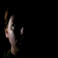
Darkness & Lightby tryals15Comment: This certainly could have been a very strong entry if you had provided a bit more light (perhaps such that approximately half of the face is illuminated - or at least the eye). The blur is a good idea, but perhaps slightly less would've worked better with voters (one thing you'll find here is that voters generally prefer things to be as sharp as they can be, within reason). |
| Photographer found comment helpful. |
Home -
Challenges -
Community -
League -
Photos -
Cameras -
Lenses -
Learn -
Help -
Terms of Use -
Privacy -
Top ^
DPChallenge, and website content and design, Copyright © 2001-2025 Challenging Technologies, LLC.
All digital photo copyrights belong to the photographers and may not be used without permission.
Current Server Time: 07/31/2025 05:06:43 AM EDT.