| Image |
Comment |
| 12/27/2004 04:44:47 AM |
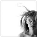
I'm Going Slightly Madby TranquilComment: lol, great title. i love the tonal contrast and texture here.. i think the choice to use b&w was probably a very good one. wish it was maybe slightly more straight on, but what's a person gonna do. |
 Photographer found comment helpful. Photographer found comment helpful. |
| 12/27/2004 01:11:56 AM |
Homage to Jacko & Rackat by hughletherenComment: from your description:
"In the unlikely event that it does well, I will explain further some of the lessons learned."
i guess you have some explaining to do! |
| Photographer found comment helpful. |
| 12/25/2004 04:14:22 PM |
|
| Photographer found comment helpful. |
| 12/25/2004 04:11:36 PM |
Torn by the Windby SandymayaComment: beautiful picture - severly underrated (i'm guessing if it were a different challenge, you may have scored much better) |
| Photographer found comment helpful. |
| 12/25/2004 03:56:57 PM |
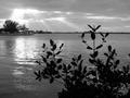
Let There Be Lifeby TranquilComment: great find. i would've liked to have seen this possibly with a greater DOF (to span the entire scene) if possible, since the focus here seems to bring our attention to the plant.. which, i just realized might work well if (judging by your title) the Life of the plant is what these rays are bringing/offering - in this case, it works well the way it is. If, however, the plant was more to offer a foreground interest, a great DOF would probably be called for. |
| Photographer found comment helpful. |
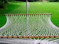
| 12/25/2004 03:52:05 PM |
This Just In! Summer's Here...Relax...by TranquilComment: i really like your choice to have the focus begin in the hammock, rather than the ropes leading into it. this helps us look straight into the inviting hammock, and then the ropes leading out bring us into the beautiful and serene surroundings that we can enjoy while we lay there. if you're on a stock photo site, you may want to try uploading this one. |
| Photographer found comment helpful. |
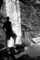
| 12/25/2004 03:46:27 PM |
And Fallsby TranquilComment: true, some darkening of the rocks in the lower right might benefit here (although I wonder if that's possible, as it looks like some of them are completely blown out). i like the choice here to freeze the water, rather than applying a long exposure. not only because it prevents the model from becoming blurred, but it also depicts an 'exact' moment in time. if you had motion blurred it, it would convey a very different message.. motion blurring water is over-rated! |
| Photographer found comment helpful. |
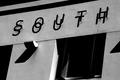
| 12/25/2004 03:42:57 PM |
§outhby TranquilComment: i love the interplay of the shadows, which you obviously also appreciated considering the title. they all pair in a wonderful manner with the real letter. i perhaps wonder how it might look if you cropped more tightly around the words, since the rest only seems to detract from [what I consider] the main subject. |
| Photographer found comment helpful. |
| 12/24/2004 11:33:47 PM |
Westby ZoomdakComment: now that i've seen the bulk of the entries, this would have ribboned if it was up to me.. but it's not :( - better luck next time! |
| Photographer found comment helpful. |
| 12/24/2004 11:32:18 PM |
Come As You Areby arnitComment: i thought the model looked familiar.. of course, the famous duo of arnit and brynja. you got robbed, better luck next time! |
Home -
Challenges -
Community -
League -
Photos -
Cameras -
Lenses -
Learn -
Help -
Terms of Use -
Privacy -
Top ^
DPChallenge, and website content and design, Copyright © 2001-2025 Challenging Technologies, LLC.
All digital photo copyrights belong to the photographers and may not be used without permission.
Current Server Time: 08/05/2025 09:49:22 PM EDT.