| Image |
Comment |
| 08/29/2011 05:16:01 PM |
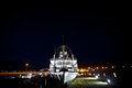
SS Klondikeby JonoTuckerComment: Nice concept. I like the idea and the image.
The upper deck seems a little blown, a little work with Burn and dodge might help. The sky seems to dominate, I would crop it a bit.
Good control of focus and depth. |
 Photographer found comment helpful. Photographer found comment helpful. |
| 08/29/2011 05:13:35 PM |
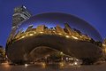
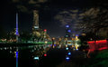
Distorted Downtown...by sekarmalathyComment: Nice
lovely control of saturation and hue.
I like the clarity of the reflection and the movement from the people.
Slightly of centre, but then again this is not too much of a fault. if itis indeed a fault. there seems to be a slight border to the sculpture, do not know if this is a proccessing fault or just a reflection. Good luck. |
| Photographer found comment helpful. |
| 08/29/2011 03:23:37 PM |
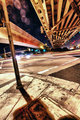
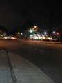
Traffic Signalby MelethiaComment: I love the breaking of the rules in this picture, the lack of thirds, the angles and lines going everywhere, the confusion which gives the whole. Even the flare adds to this. Lovely interpretation. |
| Photographer found comment helpful. |
| 08/29/2011 03:21:24 PM |
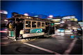
Powell streetby srugoloComment: Lovely work, well done on catching the clarity of the tram, and motion at the same time, I love this image and the obvious technical work. A little less pastel shading and more colour would help for me, but that is purelly a peronal preferance not a technical comment. Well done. |
| Photographer found comment helpful. |
| 08/29/2011 03:18:49 PM |
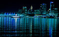
Vancouverby GolferDDSComment: Nice variation on the main theme, slightly let down by the fact this image is slanting to the right.noticably. It seems as though the ripples led you astray as they seem straight to the edge. Nice colour. good focus. |
| Photographer found comment helpful. |
| 08/29/2011 03:15:48 PM |
The City of Melbourneby Kel73Comment: Just disimilar enough from the other entries to stand out.
Nice work on focus and colour. Good control of intrest with a sky that ads to the overall effect. A minor niggle is the dark area to the left and bottom left which detracts fromt the whole, a little creative crop might increase impact. |
| Photographer found comment helpful. |
| 08/29/2011 03:13:26 PM |
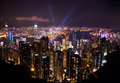
Hong Kong Light Display by bcenuComment: There are so many similar entries to this challenge that you have to stand out to be noticed, and this does. Nice lines with the V shape cupping the city. well focused and not oversaturated. Good camera work. |
| Photographer found comment helpful. |
| 08/29/2011 03:10:28 PM |
The Hot Cornerby GeneralEComment: Looks like a high ISO 800 or so . there is a grainyness to this picture that spoils the overall effect, Nice concept, but a little lacking in intrest for me. |
| Photographer found comment helpful. |
| 08/29/2011 03:08:54 PM |
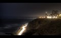
The Lighthouseby denisprayComment: I love the soft lighting and etherial feel to this shot. there seems to be a little problem with the horizon line though, to me it seems to be slanting down to the right. A little work in Photoshop rotate free rotate would sort this. |
| 08/27/2011 05:39:33 PM |
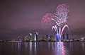
City Celestial Celebrationby louinsdComment: Fireworks, Night. They do so tempt the Photographer don't they, and with good reason. this is a lovely image that has caught the celebratory nature of the event.
Technicaly, I find the image a bit pink. toning down the warmth on saturation to darken the sky and water would punch out the city lights and fireworks. nice control of focus and depth. |
Home -
Challenges -
Community -
League -
Photos -
Cameras -
Lenses -
Learn -
Help -
Terms of Use -
Privacy -
Top ^
DPChallenge, and website content and design, Copyright © 2001-2025 Challenging Technologies, LLC.
All digital photo copyrights belong to the photographers and may not be used without permission.
Current Server Time: 08/21/2025 04:59:46 PM EDT.